Which Activewear Colors Actually Photograph Best (And Which Wash You Out on Camera)
Quick Answer: Saturated jewel tones (deep teal, cobalt, berry) and true black tend to photograph best across most lighting conditions, while pastels and low-contrast neutrals often look washed out or flat in photos, especially under harsh sunlight or indoor gym lighting.
An outfit that looks great walking into the gym can suddenly look flat or oddly colored the second you check the photo — camera sensors and real-world lighting simply don’t read color the same way your eyes do.
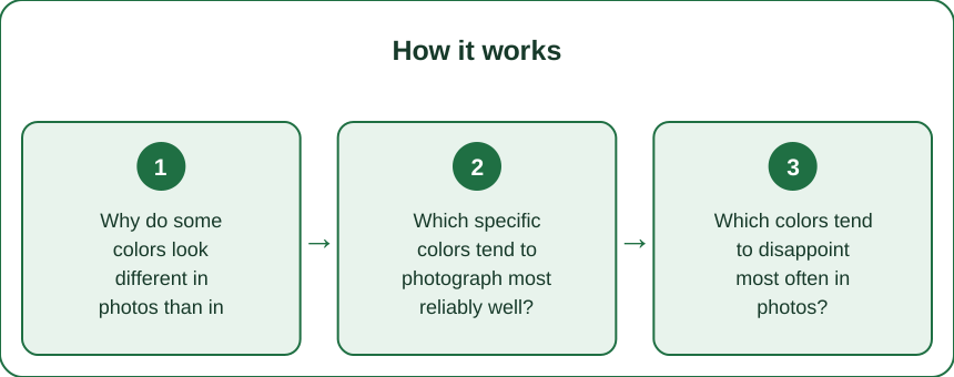
Why do some colors look different in photos than in person?
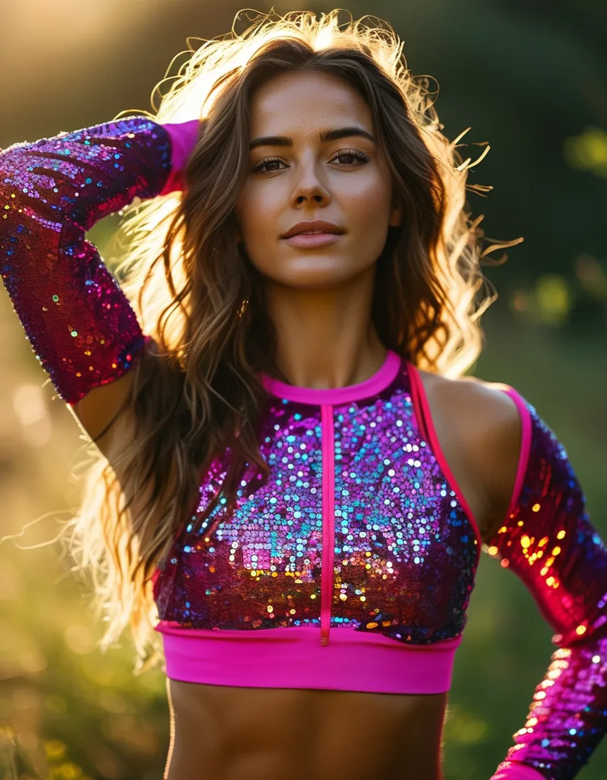
Camera sensors process light and color differently than the human eye, especially under mixed or harsh lighting. Bright, high-contrast lighting (direct sun, gym fluorescents) can wash out lighter, low-saturation colors while making deeply saturated colors read as more vivid and defined.
Which specific colors tend to photograph most reliably well?
Deep jewel tones — cobalt blue, deep teal, berry/wine red, and emerald green — hold their vibrancy across most lighting conditions. True black also photographs consistently well, reading as crisp and defined rather than flat, especially against contrasting skin tones or backgrounds.
Which colors tend to disappoint most often in photos?
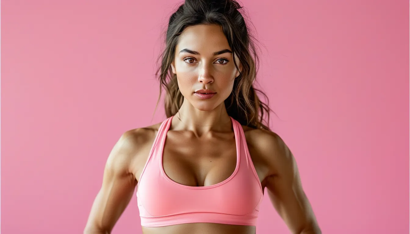
Very light pastels (pale pink, baby blue, light lavender) frequently wash out under bright or harsh light, losing definition and sometimes appearing closer to white in photos than they actually look in person. Mid-tone gray also tends to photograph as flat and lifeless compared to how it reads in person.
What Nobody Tells You About Photographing Activewear
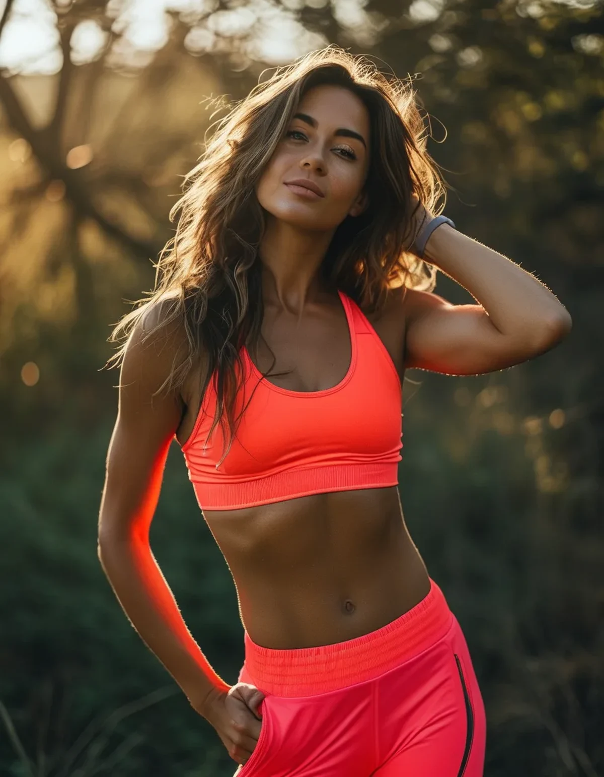
Here’s what most style content skips: the time of day and light source often matters more than the color choice itself. The exact same saturated red top can look vibrant in soft morning light and slightly harsh or overexposed under midday direct sun — if photos are a priority, shooting during golden hour (early morning or late afternoon) improves nearly any color’s photographed appearance more than swapping the outfit color would.
FAQ: Activewear Photo Colors Questions, Answered
Does skin tone affect which activewear colors photograph best?
Yes, to some extent — jewel tones tend to complement a wide range of skin tones well in photos, but personal coloring (warm vs. cool undertones) can shift which specific shades within that category look most flattering.
Is black always a safe photo choice, or does it have downsides too?
Black photographs reliably well for definition and shape, but it can also read as visually heavy or less dynamic in group or action shots compared to a saturated color that adds visual interest.
Do indoor gym photos need different color choices than outdoor photos?
Somewhat — indoor gym lighting (often fluorescent or mixed-temperature) tends to be less forgiving to pastels and grays than natural outdoor light, so saturated colors and black are an even safer bet specifically for indoor gym photos.
TL;DR:
- Deep jewel tones and true black photograph most reliably across lighting conditions
- Pastels and mid-tone grays tend to wash out or look flat in photos
- Golden hour lighting improves almost any color’s photographed appearance
- Indoor gym lighting is less forgiving to light, low-saturation colors than natural outdoor light
If photos matter for your content, saturated jewel tones are the safer bet — but good lighting does more heavy lifting than color choice alone.
Keep Reading
This article is for general informational and styling purposes only. Fit, sizing, and product availability may vary.