How to Choose One Anchor Colour That Works With Everything You Own
Quick Answer: Your anchor colour is the one you buy your bottoms in, and it should be a deep neutral that flatters your undertone and hides sweat - most often black, charcoal, navy, deep olive, or a warm brown. Choose it by checking which neutral makes your face look brighter in daylight, then buy roughly 70 percent of your bottoms in it. Everything else in your drawer immediately becomes wearable, because tops only ever have to work against one colour instead of five.
You own eleven items of activewear. You can build about four outfits from them, and three of those are the same outfit.
This is almost never a problem of not owning enough. It is a structural problem - too many colours in the position where colour matters most.
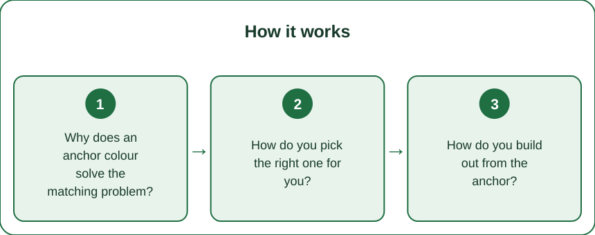
Why does an anchor colour solve the matching problem?
Because bottoms carry more visual weight, and every top has to work against them.
In an outfit made of two pieces, the leggings or shorts occupy the larger area and sit lower in the frame. They function as the base that everything else is read against.
If you own five colours of bottoms, every top you buy has to be assessed against five possible partners. Realistically it works with one or two, so most of your tops are effectively locked to specific bottoms and your combinations collapse.
If 70 percent of your bottoms are one colour, every top only has to work against that colour. A drawer of eight tops and three pairs of black leggings produces eight genuinely wearable outfits. A drawer of eight tops and eight different-coloured bottoms produces roughly three.
The maths is the entire argument. Reducing variety in one position multiplies usable combinations in the other, and it is the reason capsule wardrobe thinking works at all.
Two secondary benefits:
Replacement is simpler. When leggings wear out - and they do, faster than tops - you replace like with like and nothing else in the drawer is affected.
You stop making decisions. The anchor removes a choice from getting dressed, which matters more on early mornings than it sounds.
How do you pick the right one for you?
Three filters, applied in this order: undertone, sweat behaviour, and what you already own.
Filter one - undertone. Hold each candidate neutral near your face in daylight, not artificial light, and look at what happens to your face rather than at the fabric.
- Cool undertones generally do well with true black, charcoal, and navy.
- Warm undertones are usually better served by deep olive, warm brown, chocolate, or a soft off-black rather than a stark true black.
- Neutral undertones can wear most of them, in which case skip to the next filter.
The signal you are looking for: does the colour make your face look brighter and more even, or does it drain it and emphasise shadows? Most people can see the difference immediately once they are looking at their face instead of the garment.
Filter two - sweat behaviour. This eliminates candidates fast, because it is the practical constraint most people forget until it is too late.
- Excellent at hiding sweat: black, charcoal, deep navy, dark olive, and any busy print.
- Poor: any mid-tone solid, particularly grey - heather grey is the single worst offender in all of activewear, because sweat marks show as high-contrast dark patches.
- Also poor: light solids, which show everything.
If you train hard or in heat, this filter is non-negotiable and it will usually decide between two candidates that passed filter one.
Filter three - what you already own. Look at your existing tops. If seven of them lean warm - rust, cream, olive, terracotta - then a warm brown or olive anchor makes them all work, while charcoal will fight half of them. If your tops lean cool - blues, cool pinks, greys, white - black or navy is the obvious choice.
The candidates, briefly:
Black. The default for good reason - hides sweat, matches everything, universally available. Downside: fades noticeably and two blacks from different brands rarely match.
Charcoal. Slightly softer than black, hides sweat nearly as well, and mismatched charcoals are far less obvious than mismatched blacks.
Navy. Works well on cool undertones and reads slightly less severe than black. Pairs unusually well with denim and with warm tops.
Deep olive. The best warm-undertone option. Functions as a neutral, hides sweat, and is having a long moment in activewear so availability is good.
Chocolate or espresso brown. Excellent on warm undertones, currently widely available, and reads more considered than black.
How do you build out from the anchor?
A working ratio: 70 percent anchor bottoms, then a supporting neutral, then two or three accent colours in tops only.
The structure:
Bottoms - roughly 70 percent anchor. If you own five pairs, three or four are the anchor colour. The remainder can be a print or a second neutral for variety.
A second neutral for tops. One colour that works with your anchor and functions as a near-neutral - cream, oatmeal, soft grey, or white depending on your anchor. This gives you a light option without introducing a real colour decision.
Two or three accent colours, in tops only. This is where personality lives, and putting it in tops rather than bottoms means each accent only needs to work against one thing. Choose accents that all work with the anchor rather than accents that work with each other - the anchor does the reconciling.
Outer layers in the anchor or the second neutral. A jacket in an accent colour restricts what it goes over. A jacket in your anchor goes over everything.
How to choose accents that work:
- Against black or charcoal: almost anything works. Bright and clear colours read best; muddy mid-tones read worst.
- Against navy: warm colours pop well - rust, coral, cream, mustard. Cool pinks and light blues also work. Avoid black tops, which fight rather than harmonise.
- Against olive: cream, rust, terracotta, soft pink, and white are the natural family. Bright cool blues fight it.
- Against brown: cream, camel, pink, blue, and rust. This is a warm anchor, so it wants warm company plus one cool contrast.
One practical note on matching blacks. Two black items from different brands often differ visibly - one leans blue-black, another brown-black, and fading widens the gap. If matching bothers you, buying bottoms from the same brand and line is the simplest fix, or choosing charcoal, where the mismatch is invisible.
5 Mistakes Everyone Makes Choosing a Base Colour
1. Choosing the anchor by what is on sale. This is how drawers end up with five colours of bottoms. The sale price on a colour you would not have chosen is the most expensive purchase in the drawer, because it does not combine with anything.
2. Picking heather grey leggings. They look excellent in the shop and they are the worst possible sweat behaviour in activewear. Grey shows every mark with maximum contrast, in the least helpful places. Nearly everyone learns this once.
3. Testing the colour in shop lighting. Retail lighting is warmer and more flattering than daylight. Check any colour decision near a window or outside the door - especially the undertone test, which shop lighting will actively mislead you on.
4. Putting the accent colour in the bottoms. Bright leggings are fun and they constrain every top you own. Accent colours belong on top, where they only have to reconcile with one thing.
5. Assuming black is automatically right. Black is the safe default and it genuinely does not suit everyone - on warm or deeper undertones it can read harsh and flat, while chocolate or deep olive does the same job with a much better effect on your face. It is worth the two-minute daylight test before defaulting.
FAQ: Anchor Colour Questions, Answered
Do I have to throw out the bottoms I already own?
No. Stop buying new colours, and let attrition do the work - leggings wear out within a year or two of regular use. Replace each one in your anchor colour and the drawer converts itself within about eighteen months at no extra cost.
Can I have two anchors, one warm and one cool?
In principle, and it usually recreates the original problem at half scale. If you genuinely train in two contexts - gym versus outdoor running, for instance - splitting by context works. Splitting by mood does not.
What if my anchor colour makes everything look boring?
That is what accents are for, and the anchor is what makes them wearable. A drawer with a black base and four bright tops is more colourful in practice than one with eight colours that never combine, because you actually wear the bright tops.
How do I stop my black pieces fading at different rates?
Wash cold, inside out, on a gentle cycle, and never tumble dry. Most black activewear fading comes from heat and from detergent buildup rather than from wear. A colour-safe detergent and air drying will keep two blacks matching considerably longer.
TL;DR:
- Bottoms carry the outfit. One anchor colour there multiplies the number of usable combinations everywhere else.
- Choose it by undertone (in daylight, watching your face), sweat behaviour, and the tops you already own - in that order.
- Cool undertones: black, charcoal, navy. Warm undertones: deep olive, chocolate, soft off-black.
- Never heather grey. It is the worst sweat behaviour in activewear by a distance.
- Aim for 70 percent anchor bottoms, one supporting light neutral, and accents in tops only.
- Outer layers in the anchor, so they go over everything.
You probably do not need more activewear. You need fewer colours in the one position where colour decides what combines - and letting the current bottoms wear out and replacing them in one colour costs nothing extra.
See It in Motion
Seen here: High Waist Embossed Yoga Leggings with Side Pockets — shop it on bubblelime.com
Keep Reading
This article is for general informational and styling purposes only. Fit, sizing, and product availability may vary.