Why Your Autumn Colours Look Muddy Under Gym Lighting
Quick Answer: Gym lights are usually chosen for efficiency, not colour accuracy. Low colour-rendering lighting leaves gaps in the spectrum, and muted autumn shades — olive, rust, plum, mustard — depend on exactly the wavelengths that are missing. Saturated and cool colours survive; complex warm neutrals do not.
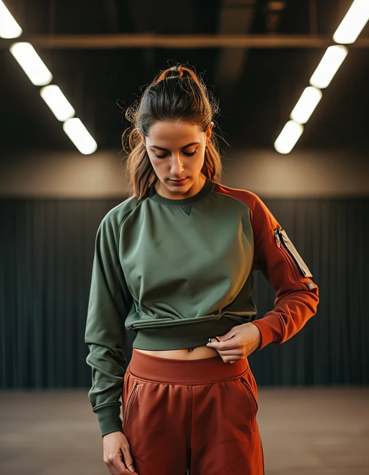
You bought the olive set in daylight and loved it. Under the gym’s overheads it reads grey-brown, slightly dirty, and about four years older than it did in the shop.
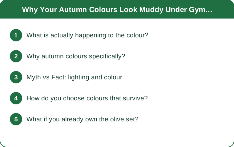
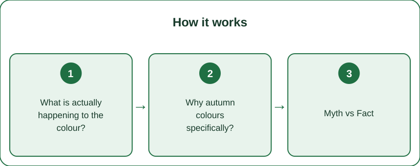
What is actually happening to the colour?
Colour is not a property of the fabric alone. What you see is the light that the fabric reflects — which means it can only reflect wavelengths that were in the light to begin with.
Daylight contains a full, smooth spectrum. Many efficient artificial sources do not. They produce light that reads as white overall while having significant gaps, particularly in the deep reds and some greens.
The metric for this is CRI, the colour rendering index, scored out of 100 against a reference. Daylight is 100. Good retail lighting is often 90+. A lot of commercial and gym lighting sits in the 70-85 range, and older fluorescent tubes can be lower still.
At CRI 80, a saturated blue is barely affected. A muted olive can shift dramatically, because olive is a complex mix that leans on precisely the wavelengths a low-CRI source under-delivers.
Why autumn colours specifically?
Because they are the most spectrally complex family in your wardrobe.
A bright cobalt is close to a single dominant wavelength — there is not much to lose. Olive, rust, plum, mustard, and terracotta are all mixtures, sitting in the middle of the space, and they rely on a broad, even spectrum to read as themselves.
Remove some deep red and an olive slides toward grey. Remove some green and a rust flattens into brown. Plum, which needs both red and blue, is the most fragile of the lot and frequently reads as muddy maroon or dull grey-purple.
This is why the effect feels seasonal. Your summer wardrobe — brights, whites, black — is largely immune. Your autumn wardrobe is built almost entirely from the vulnerable category, so the problem seems to appear overnight in September when it has actually been there all along.
Myth vs Fact: lighting and colour
Myth: The colour is different because the fabric is cheap. Fact: Dye quality affects fade over time, not how a colour renders under a given light source today. A £150 olive and a £30 olive both collapse under the same tube.
Myth: Brightness is the issue — the gym is too dim. Fact: Brightness and spectrum are independent. A very bright low-CRI light renders colour just as poorly as a dim one; it simply does it louder.
Myth: Warm bulbs make warm colours look better. Fact: Colour temperature and CRI are different measurements. A warm-looking 3000K bulb can still have a poor spectrum. Warm light does flatter warm tones somewhat, but it cannot supply wavelengths that are not there.
Myth: Phone cameras show you the truth. Fact: Phone white balance actively corrects for the light source, so photos often look better than reality. This is why gym mirror selfies and the actual room disagree.
How do you choose colours that survive?
Judge in the light you will be seen in, and bias toward robust colours for gym-specific pieces.
Colours that hold up under poor lighting:
- Saturated cool tones — true navy, cobalt, emerald, teal
- Clean black and clean white — no undertone to distort
- High-chroma brights — coral, magenta, bright lime
- Cool greys — they have less to lose than warm ones
Colours that struggle:
- Olive, sage, and all the muted greens
- Rust, terracotta, camel, and warm browns
- Plum, mauve, and dusty rose
- Warm greys and taupes, which frequently read pink or green
The practical rule: save the complex autumn palette for daylight-facing pieces — the jacket, the walk outfit, the outer layer — and put the robust colours where the lighting is unreliable.
What if you already own the olive set?
It is not wasted; it just needs the right context. Three usable strategies:
-
Break it up. A muddy olive next to another muddy neutral reads as a single grey mass. Olive against clean black or crisp white keeps its identity, because your eye judges it relative to a reference it can trust.
-
Add one saturated accent. A single high-chroma piece — a bright shoe, a strong-coloured top — gives the eye an anchor and, by contrast, makes the muted colour read as deliberate rather than washed out.
-
Move it outdoors. Walking, running, and outdoor training are exactly where the autumn palette does what you bought it for. This is a lighting problem, not a wardrobe problem.
And when you are shopping: step to a window or a doorway before deciding. Thirty seconds in daylight tells you what the colour actually is, and every changing room in the world is lit to flatter the garment rather than inform you.
TL;DR:
- Colour depends on the spectrum of the light hitting it; low-CRI gym lighting has gaps.
- Muted autumn shades are spectrally complex, so they lose the most — olive, rust, plum, taupe.
- Saturated cool tones, clean black and white, and brights survive poor lighting.
- Break up muted colours with clean contrast, add one saturated accent, and save the autumn palette for daylight.
The genuinely useful habit is checking a colour in daylight before you buy, because the shop is lit to sell and the gym is lit to be cheap, and neither one is telling you what the garment looks like. Once you know which colours are fragile, you can put them where they will be seen properly.
Keep Reading
This article is for general informational and styling purposes only. Fit, sizing, and product availability may vary.