Why That Colour Looked Different in the Shop
Quick Answer: Colour is not a property of an object, it is what happens when a light source hits a surface and your eye interprets the result. Retail lighting is typically 3000 to 4000K with high output, while home lighting runs 2700K and dim, and daylight runs 5000 to 6500K. The same garment genuinely reflects different wavelengths under each, so the colour you saw in the shop was real — it just was not the colour you will live with.
The olive looked perfect under the shop lights. At home it is distinctly grey-brown and you are not sure you like it.
You did not misjudge it. You saw a different colour, in the literal sense.
Here is what happened, and how to avoid it next time.
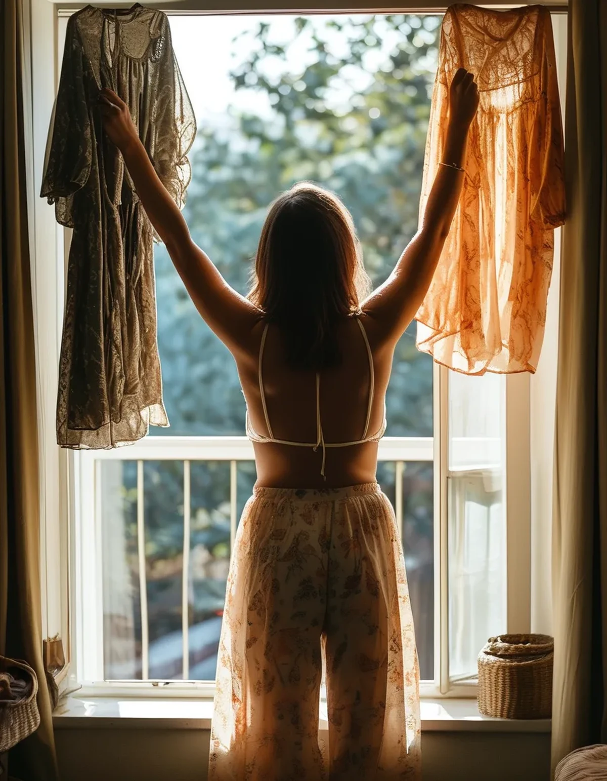
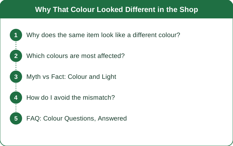
Why does the same item look like a different colour?
Because a surface can only reflect wavelengths that are present in the light hitting it.
An object has no inherent colour. What it has is a reflectance profile — a description of which wavelengths it absorbs and which it bounces back. What you perceive is that profile filtered through whatever light happens to be present.
Different light sources contain very different mixtures:
Daylight contains a full, fairly even spread across the visible spectrum, with plenty of blue. Colours look most balanced under it because there is something of everything for a surface to reflect.
Warm home lighting at 2700K is heavily weighted toward red and yellow and contains relatively little blue. A blue garment under it has less blue light available to reflect, so it appears duller and greyer.
Retail lighting at 3000 to 4000K sits in between, and is usually chosen deliberately to make merchandise look appealing — often with a high colour rendering index, meaning it reproduces colours more faithfully than typical home bulbs.
Fluorescent and cheaper LED lighting can have significant gaps in the spectrum. A colour that depends on a wavelength sitting in one of those gaps will look flat and unconvincing, which is why some colours look terrible in a changing room and fine everywhere else.
So the shop showed you the garment under bright, well-rendered, slightly warm light. Your bedroom shows it under dim, very warm light with a spectral gap. Both are real. Neither is the whole truth.
Which colours are most affected?
The differences are not evenly distributed, and knowing which colours are risky saves most of the trouble.
Highest risk — anything muted or complex: olive, sage, taupe, mushroom, dusty rose, slate. These sit near the boundary between colour families and get their character from a subtle balance of wavelengths. Change the light and the balance shifts, so an olive can read as green in one place and brown in another. Muted colours are where nearly all shopping regret lives.
High risk — deep blues and navies. Under warm home lighting, navy loses the blue that distinguishes it and drifts toward black or charcoal. This is why people end up unable to tell two garments apart at home that were obviously different in the shop.
Moderate risk — purples and burgundies. They contain both red and blue components, and warm light amplifies one while suppressing the other.
Lower risk — strong saturated primaries. A vivid red, a bright yellow, a strong turquoise. They reflect strongly across a narrow band and there is enough of that band in almost any light source.
Lowest risk — black, white, and true grey. They reflect broadly and evenly. What changes is their apparent warmth rather than their identity.
There is a related problem worth naming: metamerism. Two fabrics that match perfectly under one light source can visibly mismatch under another, because they achieve the same appearance through different reflectance profiles. This is why a top and leggings that matched in the shop can clearly clash in daylight — and it is a dye chemistry issue, not a manufacturing fault.
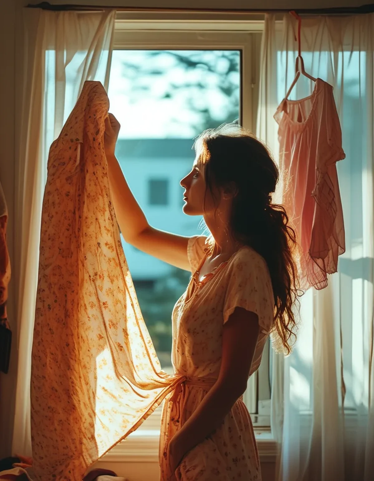
Myth vs Fact: Colour and Light
Myth: Daylight shows the true colour. Fact: Daylight shows a colour, and it is the most useful reference because it is broad-spectrum and consistent-ish. But daylight itself varies enormously — overcast at midday is around 6500K and heavily blue, while an hour before sunset is around 3000K and strongly warm. There is no single true colour, only a colour under stated conditions.
Myth: Changing room mirrors are deliberately distorting. Fact: Lighting is genuinely chosen to flatter, but rarely to deceive about colour — it is usually higher quality than home lighting, not worse. The problem is the mismatch with where you will actually wear it.
Myth: Photographing it on your phone gives you the answer. Fact: Phone cameras apply automatic white balance, which actively corrects for the light source. That is precisely the information you are trying to see. A photo can be useful for shape, and is unreliable for colour.
Myth: You can just compare it to something you own. Fact: This is actually the best available method, provided you do it under the light you care about. Comparing against a known garment in the shop is far more informative than assessing it alone, because you know what the reference looks like at home.
Myth: Black is black. Fact: Black dyes vary considerably in undertone — some blue-black, some brown-black, some green-black. Under warm home light the undertones become visible, which is why two black items that looked identical in a shop can clearly clash at home.
How do I avoid the mismatch?
Practical steps, in order of how much they help:
Take it to the shop window or the door. Thirty seconds in daylight tells you more than ten minutes under retail lighting. This is the single most effective habit and it costs nothing.
Bring the item you plan to pair it with. Especially critical for anything that needs to match — a top for particular leggings, a jacket for a specific pair of boots. Metamerism means matching under one light guarantees nothing.
Check it in the changing room and outside the changing room. Two different lighting zones in the same shop, and the difference between them is often startling.
Learn your own lighting. If your bedroom runs very warm at 2700K, you can predict the shift — blues and greens will go duller, warm tones will look richer. Knowing your bias means you can compensate mentally.
Be extra careful with muted tones bought online. Screen colour depends on your display calibration, the photographer’s lighting, and any editing. Muted colours are exactly the category where screens are least reliable.
Consider a higher-CRI bulb where you get dressed. A single bulb with a high colour rendering index in the bedroom or wardrobe area makes your home assessment much closer to daylight, and it makes getting dressed easier every day rather than only when shopping.
Check the return policy before buying a muted colour. Sometimes the honest answer is that you cannot know until you see it at home.
FAQ: Colour Questions, Answered
Why do my black leggings and black top not match?
Different dye chemistries with different undertones, revealed by your home lighting. Under a shop’s brighter light the difference is swamped; under a warm dim bulb it becomes obvious. Nothing is wrong with either garment.
Does fabric type change how colour reads?
Considerably. Shiny surfaces reflect the light source’s own colour back at you, so a satin picks up the warmth of a room more than a matte knit in the same dye. Texture also scatters light, which makes textured fabrics look slightly lighter and less saturated.
Will the colour change after washing?
Some fading is normal, and it is fastest in the first few washes. Muted colours show fading more readily than saturated ones because they have less colour to lose before the character changes.
TL;DR:
- Colour is a relationship between a light source, a surface, and your eye — not a fixed property
- Retail lighting, home lighting, and daylight contain genuinely different wavelength mixtures
- Muted colours like olive, sage, and taupe are the highest risk; saturated primaries are the safest
- Two fabrics that match under one light can clash under another, which is metamerism
- Take it to a window, bring the piece you want to pair it with, and do not trust phone photos
The olive you loved in the shop and the olive you have at home are the same garment reflecting a different mixture of light. Thirty seconds by the shop door before you buy is the entire solution.
See It in Motion
Seen here: High Waist Yoga Leggings with Side Pockets — shop it on bubblelime.com
Keep Reading
This article is for general informational and styling purposes only. Fit, sizing, and product availability may vary.