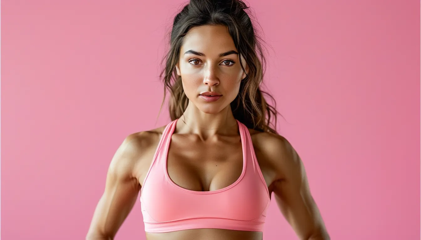
How to Build a Colorful Activewear Wardrobe
Quick Answer: Build a colorful activewear wardrobe on a 3-2-1 rule: three brights that all work with each other, two anchoring neutrals, one print. That’s roughly 8–10 pieces producing dozens of combinations, instead of a drawer of orphan colors that only match themselves.
There’s a specific failure mode here and you may already own it: a drawer with seven bright pieces, none of which go with any of the others.
Each one was lovely on its own. Together they’re a set of orphans, and you end up in black leggings again. Building a colorful activewear wardrobe that actually mixes takes about ten minutes of planning up front — here’s the plan.
What’s the Formula for a Colorful Wardrobe That Mixes?
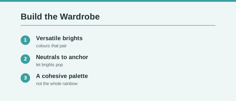
Three brights, two neutrals, one print. Six categories, roughly 8–10 actual pieces.
Here’s why the ratio works: if your three brights all coordinate with each other and with both neutrals, a single bright top pairs with four different bottoms. Multiply that across the set and 8 pieces produce 20+ genuinely different outfits. Seven uncoordinated brights produce seven.
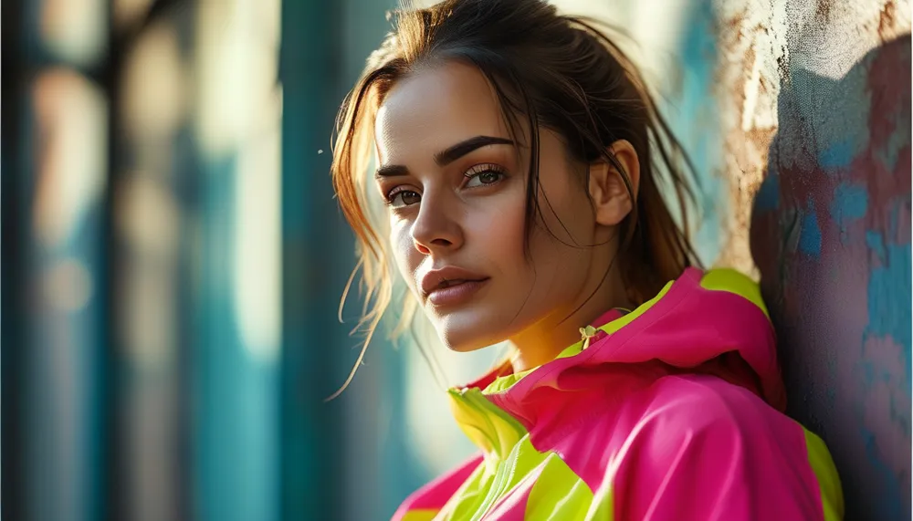
The three brights should share a temperature — three warm shades (coral, terracotta, gold) or three cool ones (teal, cobalt, violet). Mixing a cool pink with a warm orange is where drawers go wrong. Same-temperature colors nearly always look intentional together, even when they’re loud.
The two neutrals do the heavy lifting: black or charcoal, plus one of grey, navy, or cream. These are what let a bright piece be worn three times a week without feeling repetitive.
The one print should pull its colors from your existing brights. That’s what makes it a member of the wardrobe instead of a guest.
Which Pieces Should Be Bright and Which Should Be Neutral?
Two rules decide almost every purchase.
Rule 1: Neutral bottoms, bright tops — if you’re buying only a few pieces. Bottoms get worn more often and with more things, so a neutral legging earns its cost-per-wear faster. Meanwhile color reads strongest near your face, so a bright sports bra or tank delivers more visible impact than bright leggings do.
Rule 2: Buy bright bottoms once you have the neutrals covered. Bright leggings with a grey tank is a great outfit — you just want the grey tank to exist first.
A practical starter set:
- 1 black legging (the workhorse)
- 1 grey or navy legging
- 1 bright sports bra
- 1 bright tank or tee
- 1 bright legging in one of your three colors
- 1 neutral top
- 1 printed piece drawn from your palette
One buying note that matters for bright bottoms specifically: light and saturated colors are more likely to go sheer under stretch than black is. If you’re buying a pale or neon legging, look for squat-proof leggings explicitly, and do the bend test before you cut the tags.
Why Do Neutrals Matter in a Colorful Wardrobe?
Because contrast is what makes a bright color read as chosen rather than as noise.
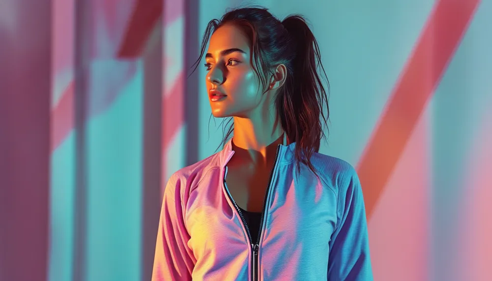
A vibrant top with black leggings looks deliberate. A vibrant top with vibrant leggings in a different color family looks like laundry day. The neutral isn’t a compromise — it’s the frame that makes the color a focal point.
The other function is arithmetic. Neutrals multiply your combinations. Every neutral piece pairs with every bright piece, so two neutrals across a six-bright wardrobe add twelve outfits on their own.
Don’t skip them, and don’t treat them as the boring part of the shop.
5 Mistakes Everyone Makes Building a Colorful Wardrobe
The third one is the actual reason most colorful drawers fail.
- Buying whatever’s on sale. Sale racks are sorted by what didn’t sell, not by what coordinates. This is how orphan colors enter a wardrobe.
- Mixing color temperatures. Warm coral and cool fuchsia will fight each other forever. Pick a lane per palette.
- Skipping neutrals because they’re “not the point.” They are the point. They’re what makes the brights wearable more than once a week.
- Buying prints before solids. A print needs solids to pull from. Bought first, it matches nothing.
- Ignoring opacity on light colors. A pale legging that goes sheer in a squat is a piece you’ll never wear, no matter how good the color is.
How Do You Use Color for Motivation?
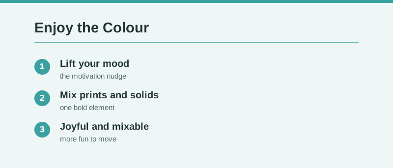
This is the underrated part. Reaching for a vibrant set on a grey, low-energy morning is a genuinely effective nudge — not because color has magic properties, but because gear you’re excited about gets worn more.
Use it strategically:
- Keep your favorite bright set visible at the front of the drawer, not buried.
- Save it for the hard days. If Monday morning is your weak point, that’s when the coral set comes out.
- Lay it out the night before. Removing the decision removes the friction.
If a bright set gets you to three extra workouts a month, that’s 36 a year. No fabric technology on the market does that.
How Do You Mix Prints and Solids?
One rule: pull the solid from the print. If your printed legging has coral, teal, and cream in it, wear a coral top, a teal top, or a cream top with it. Never a fourth color.
And keep one element the star. Print bottom plus solid top, or print top plus solid bottom — never both. One bold element at a time is what keeps even the brightest wardrobe looking pulled together rather than chaotic.
Mini FAQ
How many colorful activewear pieces do I actually need?
Around 8–10 total, following the 3 brights, 2 neutrals, 1 print structure. That’s enough for a full week of varied outfits without duplicates, and adding beyond it gives diminishing returns unless you’re replacing worn pieces.
Can I mix two different bright colors in one outfit?
Yes, if they share a temperature — two warm brights or two cool brights read as intentional. A warm bright with a cool bright usually looks accidental, so anchor one of them with a neutral instead.
Do bright leggings show sweat more than black?
Mid-tone greys and pale pastels show sweat most; saturated brights and darks hide it well. If that’s a concern, go bold and saturated rather than light.
TL;DR:
- Build on 3 brights + 2 neutrals + 1 print — about 8–10 pieces, 20+ outfits.
- Keep all three brights in the same color temperature.
- Neutral bottoms, bright tops first — color reads strongest near your face.
- Check opacity on light and bright leggings before you commit.
- Pull print outfits from the print’s own colors, and keep one bold element per look.
See It in Motion
Seen here: Super High Waist Embossed Yoga Leggings with Inner Pocket — shop it on bubblelime.com
Keep Reading
This article is for general informational and styling purposes only. Fit, sizing, and product availability may vary.