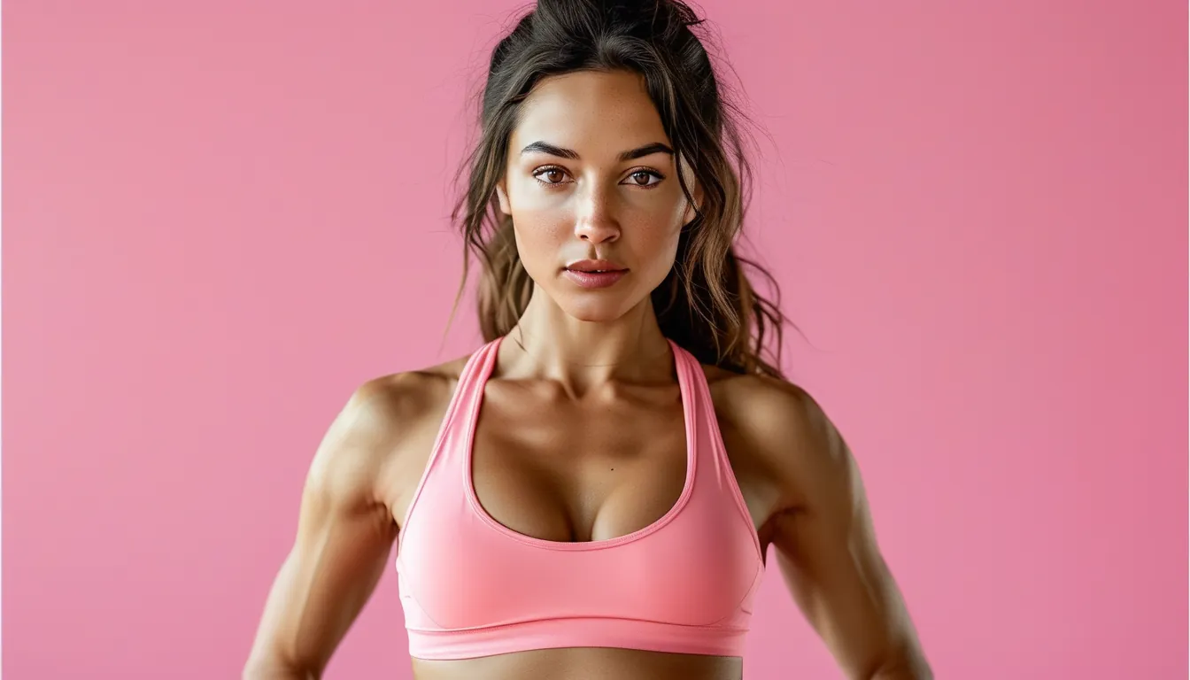
Building an Activewear Palette That Works From August Into October
Quick Answer: A working activewear palette needs three tiers - two or three neutrals that make up most of the wardrobe, one or two mid-tones that connect them, and a small number of accent pieces. The reason drawers full of clothes produce nothing to wear is usually too many accents and not enough mid-tones, so nothing bridges the extremes.
The problem is rarely that you own too little. It is that the pieces you own were each bought as a good idea in isolation.

Why does a full drawer produce nothing that matches?
Because most activewear is bought as individual items rather than as parts of a system, and accent colours are the most tempting individual purchase.
How the buying pattern goes wrong. Basics are boring to buy, so people already own black leggings and buy the interesting thing - a bright top, a printed set, a seasonal colour. Over three years this produces a drawer of accents with nothing to pair them with.
The three-tier structure that fixes it:
- Tier 1 - Neutrals, roughly 60 percent of the wardrobe. Black, charcoal, cream, oatmeal, deep navy, warm grey. These are the pieces every other piece has to work with.
- Tier 2 - Mid-tones, roughly 30 percent. Sage, dusty rose, clay, olive, mocha, slate blue. These are the connective tissue and they are the tier most people are missing entirely.
- Tier 3 - Accents, roughly 10 percent. Bright or saturated colours, prints, anything seasonal.
Why mid-tones are the missing piece: a bright coral top with black leggings works, and it is the only thing that coral does. A clay-toned top works with black, cream, olive and navy - it multiplies rather than adds.
A quick audit worth doing once: lay everything out and sort into the three tiers. Most people find they are heavy on tier 1 and tier 3 with almost nothing in tier 2, which explains the sense of having nothing to wear despite a full drawer.
The fix is usually two or three purchases, not a rebuild - a mid-tone top and a mid-tone legging typically unlock a large number of new combinations immediately.
Choosing a palette that carries into autumn
Colour appropriateness is more about undertone and saturation than about specific hues.
What makes a colour read as autumnal:
- Warmer undertones - clay over pink, olive over lime, rust over red
- Lower saturation - muted rather than fluorescent
- Deeper values - burgundy over cherry, forest over grass green
A palette that works for the transitional months:
- Neutrals: black, cream, warm grey, deep chocolate
- Mid-tones: olive, clay, dusty mauve, slate blue
- Accents: rust, burgundy, deep teal
And one that stays cool-toned, if warm colours do not suit you:
- Neutrals: charcoal, off-white, navy
- Mid-tones: sage, dusty blue, mushroom
- Accents: plum, emerald, deep raspberry
On the practical points that get ignored:
- Black is the most versatile and the least forgiving. Blacks from different brands and different fabrics rarely match, and the mismatch is obvious in daylight. Buy tops and bottoms in black from the same brand and range where you can.
- Light colours show sweat. Grey is notorious; cream and oatmeal are better than they look because the contrast is lower.
- Bright colours fade fastest, particularly reds and neons under UV and repeated washing
- Prints are accents, regardless of colour. Two prints in a single outfit needs deliberate work.
Building the palette without replacing anything: choose your neutrals based on what you already own most of. The palette should be a description of your existing wardrobe plus two or three additions, not a new specification you now have to buy into.
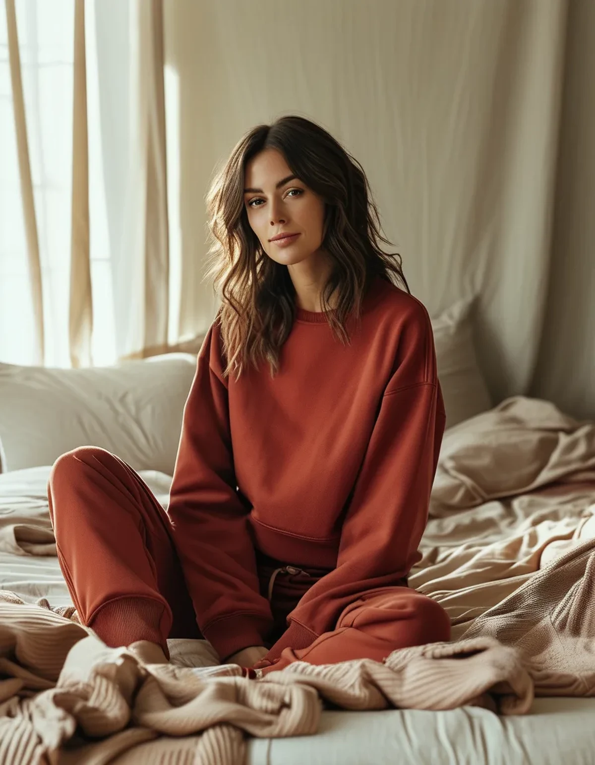
Making the pieces actually work together
Combination rules that are simple enough to use while getting dressed at 6am.
The reliable formulas:
- Tonal: everything in shades of one colour family. The most current-looking option and the easiest to get right.
- Neutral plus one: neutral bottom, mid-tone or accent top
- Two neutrals plus texture: black and cream, with the interest coming from ribbing, mesh or a fabric contrast
- Mid-tone plus mid-tone: olive and clay, sage and mushroom. This works far more often than people expect and it is why tier 2 is so valuable.
What tends not to work:
- Two accents together, unless deliberately styled
- Near-matches - two blacks that are slightly different, or a navy that is almost the same navy. The eye reads near-matches as an error and exact matches or clear contrasts as intentional.
- Warm and cool versions of the same colour side by side, such as a cool pink with a warm coral
Layers change the equation. As the weather cools, an outer layer becomes the largest colour block in the outfit. A neutral outer layer means the pieces underneath can be anything; a bright jacket makes everything under it a coordination problem.
- Buy outerwear in neutrals, always. It is the highest-usage item and the most expensive to get wrong.
- Save the colour for the layer you take off
A note on how colours photograph, which matters if you are documenting training: saturated colours read considerably brighter on camera than in person, and light neutrals can wash out under indoor gym lighting. Mid-tones photograph the most reliably, which is another argument for the tier most people are missing.
Myth vs Fact: Activewear Colour
Myth: You need to know your season or colour analysis type. Fact: it can be a useful shorthand, but the practical test is simpler - hold the colour near your face in daylight and see whether you or the garment is more noticeable. Undertone matters; formal categorisation is optional.
Myth: Black is always slimming. Fact: black hides seam detail and construction, which is why it reads as simple - but fit does far more than colour, and a well-fitted mid-tone legging usually looks better than a poorly fitted black one.
Myth: Bright colours are for summer only. Fact: a single saturated accent against autumn neutrals reads deliberate and seasonal. What dates an outfit is a full outfit of bright summer colours, not one bright piece.
Myth: Matching sets are the easy option. Fact: they are easy on the day and inflexible afterwards, because set pieces often do not combine well with anything else. Two coordinating separates in mid-tones produce more outfits than one set.
Myth: You should replace faded pieces. Fact: faded activewear frequently sits in the mid-tone tier that most wardrobes are short of. A faded black is a warm grey, and it may be more useful than it was new.
FAQ: Activewear Colour Questions, Answered
How many colours should an activewear wardrobe have?
Roughly two or three neutrals, two or three mid-tones, and one or two accents. Most drawers have plenty of the first and third and almost nothing in the middle.
Why do my black pieces never quite match?
Different fabrics and dye lots produce visibly different blacks, and the difference shows most in daylight. Buying tops and bottoms from the same brand and range reduces it.
What colours hide sweat best?
Black and very dark tones, and light colours with low contrast such as cream and oatmeal. Mid-grey is the worst by a considerable margin.
Should I buy a matching set?
Sets are convenient and inflexible. Two coordinating separates in mid-tones generate more combinations for the same money.
What colour should outerwear be?
A neutral, essentially always. It is the largest colour block, the highest-usage item, and the one that constrains everything worn under it.
TL;DR:
- Three tiers: 60 percent neutrals, 30 percent mid-tones, 10 percent accents
- Mid-tones are the missing tier in most wardrobes, and they are what makes everything combine
- Warm undertones, lower saturation and deeper values read as autumnal
- Near-matching blacks look like errors; exact matches or clear contrasts look intentional
- Buy outerwear in neutrals and save the colour for the layer that comes off
Audit the drawer into three piles once. Two or three mid-tone purchases usually unlock more outfits than a season of buying accents ever did.
See It in Motion
Seen here: High Waist Embossed Yoga Leggings with Side Pockets — shop it on bubblelime.com
Keep Reading
This article is for general informational and styling purposes only. Fit, sizing, and product availability may vary.