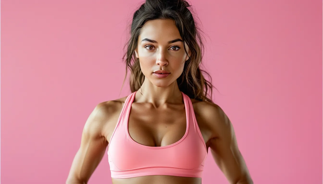
Choosing Activewear Colours That Suit You (Beyond Just Buying Black)
Quick Answer: The colors that suit you are decided by three things — your undertone (warm or cool), your natural contrast level, and how saturated the shade is. Test any color by holding it beside your face in daylight and watching your skin, not the fabric. Save your best colors for tops; wear anything you like on the bottom half.
You put on a top, glance in the mirror, and look faintly like you’ve been up since 4am. Same sleep, same skin, different shirt.
That’s not your imagination and it’s not the lighting. Undertone, contrast, and saturation genuinely change how a color reads against your face — which is exactly why most activewear drawers quietly become 80% black. Here’s how to figure out yours.
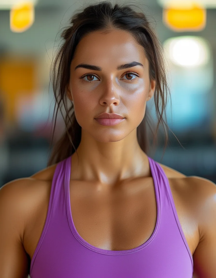
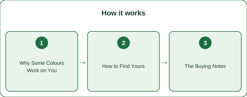
Why Do Some Colours Suit You and Others Don’t?
Three variables do almost all the work.
Undertone decides the family. Warm undertones (golden, peachy, olive) tend to lift in coral, olive, rust, and cream. Cool undertones (pink, blue, neutral-ash) tend to lift in berry, true blue, emerald, and stark white. A quick check: hold a gold and a silver item near your jaw and see which one makes your skin look brighter rather than sallow.
Contrast decides the intensity. If your hair, skin, and eyes are close in depth, you’re low contrast — soft, blended colors read better on you. If there’s a big gap (dark hair, fair skin), you’re high contrast and can carry sharp color pairings that would overwhelm someone else.
Saturation decides the volume. A dusty sage and a neon lime are the same hue at different volumes. One can be your best color while the other wears you.
And the reason this matters most in activewear: the effect is strongest within about 12 inches of your face. A sports bra or tank sits right in that zone. Leggings don’t.
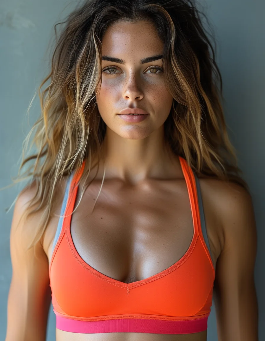
How Do You Find Your Best Colours at Home?
You don’t need a paid color analysis. You need a window and ten minutes.
- Stand near natural daylight. Store lighting and bathroom bulbs both lie — one flattens everything, the other adds yellow.
- Hold the garment up beside your face, not across your body. You’re testing the reflection onto your skin.
- Watch your skin, not the fabric. The question is never “is this a nice color.” It’s “does my skin look brighter or greyer with this next to it?”
- Compare a warm and a cool version of the same color. A blue-red versus an orange-red tells you more in five seconds than an hour of theory.
- Do it in a plain top so the color you’re testing is the only variable.
Two free data sources you already have:
- What you get complimented in. People rarely say “nice shirt” — they say “you look well today.” That’s a color result.
- What never leaves the drawer. The piece you own and never reach for is usually a color that doesn’t work, not a style that doesn’t.
Myth vs Fact
Myth: Everyone is either “warm” or “cool.” Fact: A large share of people are genuinely neutral and look fine in both families. If gold and silver both look okay on you, stop hunting for a verdict and pick by shade instead.
Myth: Neutrals are safe, so they don’t need testing. Fact: Neutrals have undertones too. Warm cream and cool optic white are not interchangeable, and grey ranges from blue-grey to greige. Most “this beige washes me out” moments are undertone mismatches.
Myth: If a color doesn’t suit you, you can’t wear it. Fact: You can wear it below the waist all day long. Color rules apply near the face and lose most of their force by the hip.
Myth: Black is a cop-out. Fact: Black is a legitimately good default — it’s high contrast, it goes with everything, and it’s the most requested color in squat-proof leggings for a reason. The problem isn’t owning black. It’s owning only black.
How Should You Buy Colour Once You Know Yours?
Shop with a two-zone rule and it gets simple.
- Near the face — be strict. Tops, sports bras, jackets, and hoodies get your three or four proven colors. This is where a wrong shade costs you.
- Below the waist — be free. Leggings, shorts, and joggers can be any color you enjoy. Nobody’s judging your undertone from your knees.
Then build, don’t scatter. Pick two or three colors that all work with each other and with your neutrals — that’s what makes a drawer of separates actually mix. One genuinely bright piece will do more for an all-black setup than five more neutrals; if you’re adding just one thing this season, make it a top in a color you tested and liked, paired with the high waist yoga pants you already reach for.
Last practical note: check the shade, not the name. Brands call four different greens “sage.” Look at the photo, and if you’re buying online, look for a photo shot in daylight rather than studio light.
Mini FAQ
How do I know if I have a warm or cool undertone?
Check the veins on your inner wrist in daylight — greenish leans warm, bluish leans cool, and a mix suggests neutral. Cross-check with the gold-versus-silver test; if both point the same way, you have your answer.
Does colour analysis matter for leggings?
Barely. The effect is strongest near the face, so leggings are the one place you can ignore the rules entirely. Buy the color that makes you want to work out.
Can my best colours change over time?
Yes. Hair color changes, sun exposure, and greying all shift your contrast level, and greying in particular usually pushes people toward cooler, softer shades. Re-test every few years or after any big hair change.
TL;DR:
- Three things decide it: undertone, contrast, saturation — and the effect is strongest within 12 inches of your face.
- Test in daylight, hold the color beside your face, and watch your skin rather than the fabric.
- Reserve your best colors for tops and bras; wear anything you like on the bottom half.
- Neutrals have undertones too — “washed out in beige” is usually a warm/cool mismatch.
- Build around two or three working colors, add one bright piece, check the shade not the name — and black is still fine.
See It in Motion
Seen here: Super High Waist Embossed Yoga Leggings with Inner Pocket — shop it on bubblelime.com
Keep Reading
This article is for general informational and styling purposes only. Fit, sizing, and product availability may vary.