The Psychology of Color in Your Activewear
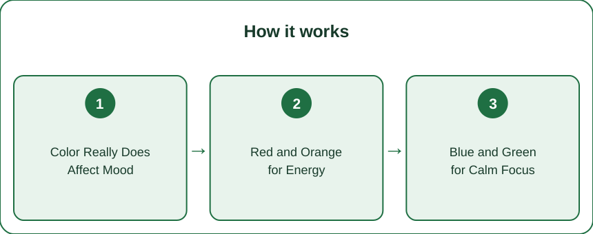
Quick Answer: Color influences mood and perceived energy, so your activewear palette can nudge how a workout feels before you’ve moved. Warm shades like red and orange suit high-output sessions, cool blues and greens suit yoga and recovery, and the single best rule is to wear the color that makes you stand taller in the mirror. Keep 3–4 intentional colors instead of defaulting to all black.
You pulled on the bright set on a Tuesday and somehow attacked the session. You pulled on the washed-out grey one on Wednesday and negotiated your way out after twenty minutes.
Same body. Same sleep. Different color.
That’s not imagination — or rather, it is, in exactly the way that counts.
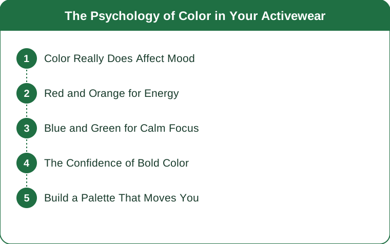
Does the Color You Wear Really Affect Your Mood?
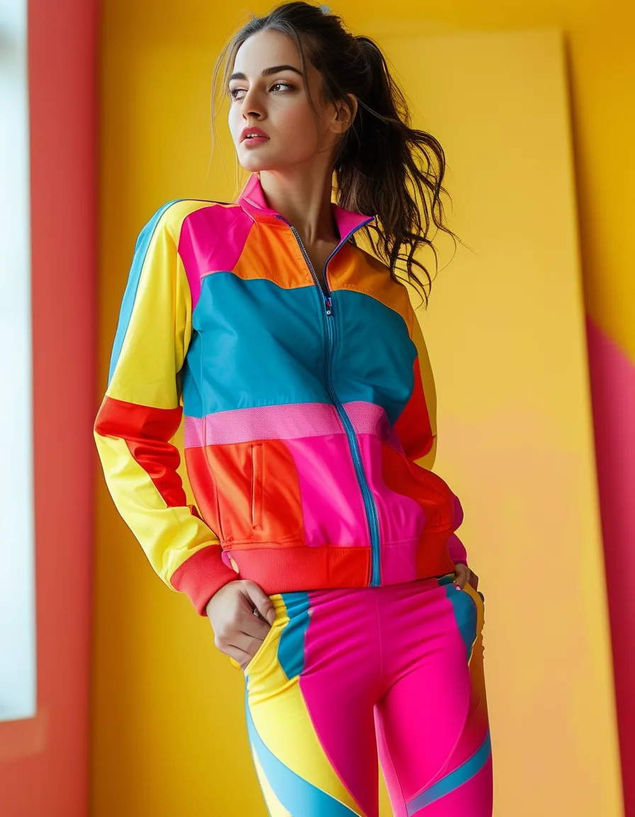
Research consistently links color to emotional and physical response — warm hues with arousal and alertness, cool hues with calm and focus. The effect sizes are modest, but they’re real, and they stack with everything else in your environment.
Here’s the part people miss: what you wear is part of your environment. You look at it, you catch it in mirrors, you feel it. For an hour, your gym set is roughly 30% of your visual field. It isn’t neutral.
The effect runs in two directions too. There’s the internal one — how the color makes you feel — and the external one, how you carry yourself when you think you look good. The second is arguably stronger.
What Colors Should You Wear for a High-Intensity Workout?
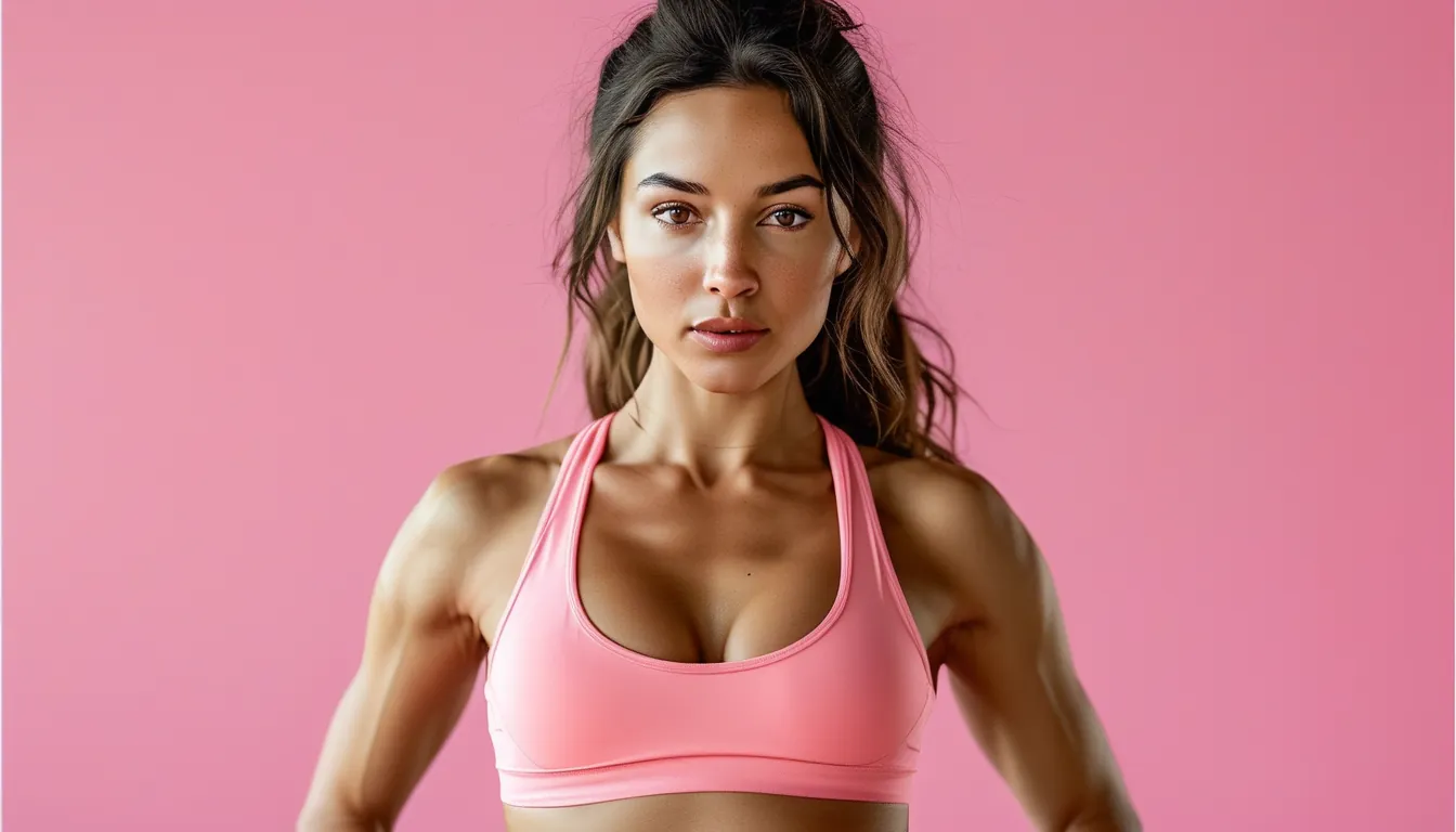
Reach for red, orange, and hot coral on the days that need attacking — intervals, heavy lifts, the sprint session you’ve been avoiding since March.
Warm, saturated colors are associated with intensity and drive. Practically speaking, they read as loud, and loud is useful when you’re trying to override the part of your brain that would rather sit down.
A useful test: if the set feels slightly too bold to wear to the grocery store, it’s probably right for a hard session. Bright yellow-greens and electric coral are the classic “I’m here to work” shades for a reason.
Which Colors Are Best for Yoga and Recovery Days?
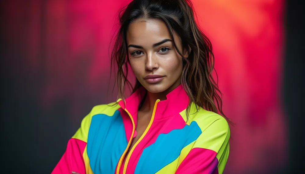
Blues, sage greens, soft lavenders, and muted earth tones. These read as calm and are easier to be near for a long, slow session.
There’s a practical layer too. On a 60-minute yoga flow you spend a lot of time looking down at your own legs. A screaming neon in that position is visually busy in a way that fights the intention of the practice.
Recovery days, mobility work, long walks, and restorative flows all suit the cooler half of the wheel. Set the tone before you’ve moved a muscle.
What Nobody Tells You About Activewear Color
- All-black isn’t neutral — it’s a mood too. It reads serious, minimizing, and slightly withdrawn. Wonderful for a heavy squat day, a bit deadening on the fifth grey Tuesday in a row.
- Color changes how long you keep the piece. People wear “colors I feel good in” roughly twice as often as safe purchases. The most sustainable legging is the one you actually reach for.
- Fit and color interact. A bold color on a poorly-fitting piece amplifies the discomfort, because now you’re self-conscious and visible. Bold colors demand a piece you trust.
- The mirror test beats every color theory chart. Whatever makes you stand up straighter wins, regardless of what the wheel says.
- Your palette should have exactly one “armor” color. The set you save for the day you least want to train. This one surprises people — but everyone who has one uses it.
How Do You Build an Activewear Palette That Actually Works?
Stop buying color by accident. Curate four:
- One energizer — red, coral, or bright citrus for hard sessions.
- One calmer — sage, dusty blue, or stone for yoga and recovery.
- One workhorse neutral — black or charcoal that pairs with everything.
- One armor piece — whatever makes you feel unstoppable, regardless of category.
Then match the color to the workout the night before. It sounds fussy; it takes four seconds and removes a decision from the moment you’re most likely to bail.
If your current rotation is five identical black pairs, the single highest-return purchase is one genuinely bold set — a high waist yoga legging in a color you’d notice across a room. Squat-proof, so the boldness doesn’t come with a hidden cost.
Frequently Asked Questions
Does wearing black activewear actually make you look slimmer?
Somewhat — dark, matte colors reduce visible shadow and contour, which flattens the silhouette. But fit does far more of that work than color does. A well-cut piece in bright coral will almost always read better than a poorly-fitting black one.
Do bright colors show sweat more than dark ones?
Yes, mid-tone brights and light greys show sweat marks most obviously. True darks and very saturated colors hide it best, and textured or patterned fabrics hide it better still. If sweat visibility is your concern, prioritize fabric and pattern over color.
Is there a color that actually improves athletic performance?
No color has been shown to make you stronger or faster. What color affects is mood, arousal, and confidence — which influence effort and adherence. That’s an indirect but genuinely useful lever, not a physiological one.
How many colors should be in an activewear wardrobe?
Three to five is plenty. Fewer than three and you lose the mood-matching benefit; more than five and pieces stop mixing together, which means less wear per item. A tight palette also means every top works with every bottom.
TL;DR:
- Color influences mood and confidence, and your gym set is a big share of what you look at for an hour.
- Warm and saturated (red, coral, citrus) for high-output sessions; cool and muted (blue, sage, stone) for yoga and recovery.
- All-black is a mood, not a neutral — five grey Tuesdays in a row take a toll.
- Build a four-color palette: energizer, calmer, workhorse neutral, armor piece.
- The mirror test wins over any theory: wear the color that makes you stand taller.
Keep Reading
This article is for general informational and styling purposes only. Fit, sizing, and product availability may vary.