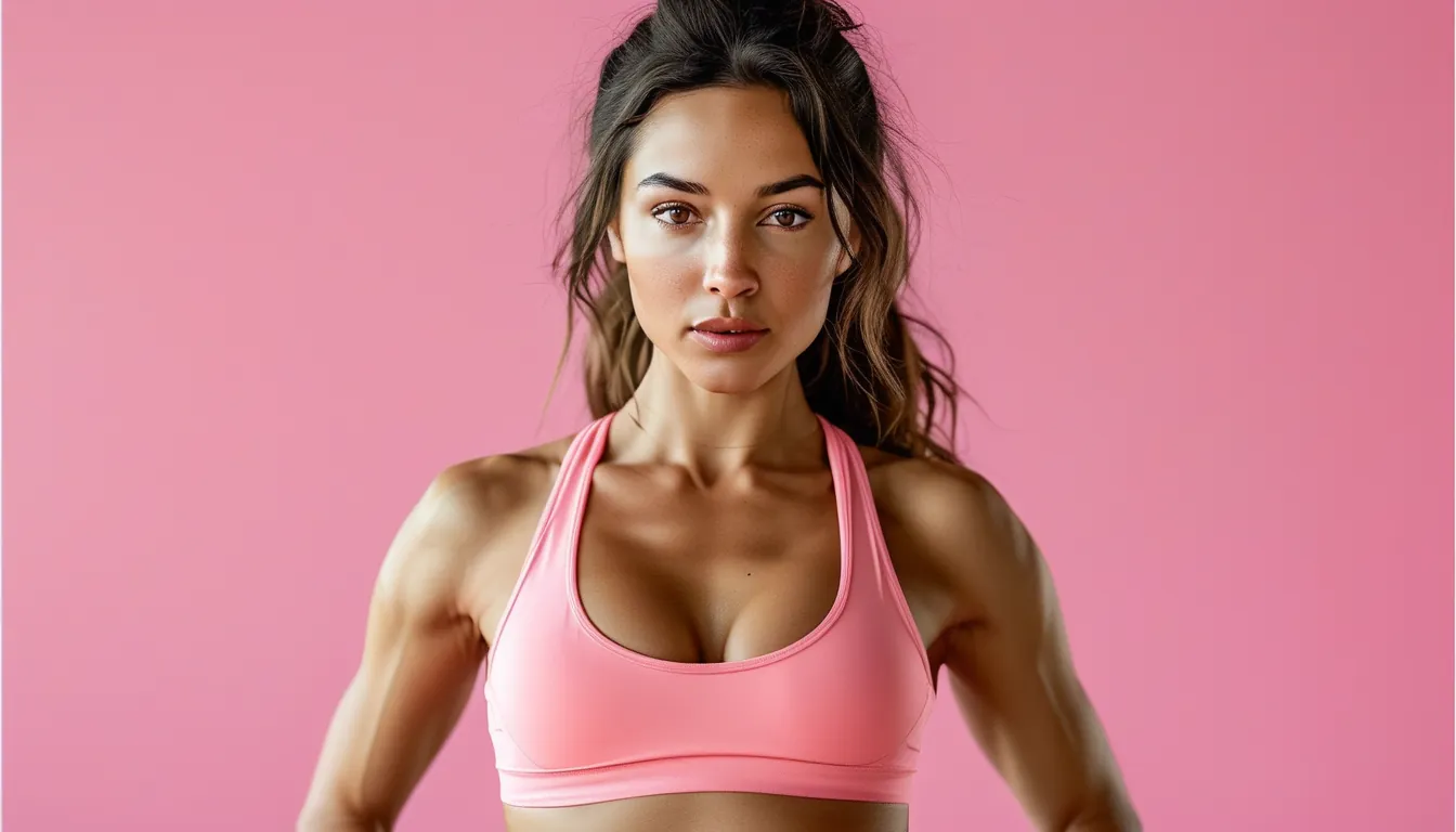
How to Transition Your Activewear Colours Into Fall
Quick Answer: Summer activewear colours read as autumn when you change what surrounds them rather than replacing them. Pair brights with a deeper neutral instead of white, add one warm-toned piece - rust, olive, camel, burgundy - and swap light-coloured shoes for something deeper. The same neon top that looked like July next to white leggings looks like October next to charcoal.
Your whole drawer is coral and mint and it is about to feel wrong for eight months.
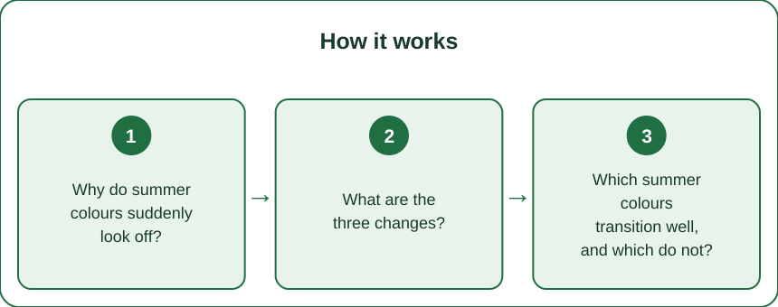
Why do summer colours suddenly look off?
Nothing changes about the colour. What changes is everything around it, and colour is read relationally rather than absolutely.
The light changes first. Late-summer and autumn light is warmer and lower-angled than midsummer light, and cool pastels - mint, powder blue, lilac - look chalky and flat under it, while warm tones look richer.
The environment changes. Green foliage turns to warm rust and gold, and a colour that harmonised with green summer surroundings can clash with autumn ones.
What everyone else wears changes. Colour reads relative to context, and a bright coral surrounded by charcoal and camel reads differently than the same coral surrounded by white and pastel.
And what you pair it with changes. This is the part you control, and it does most of the work. A neon top next to white shorts and white trainers is unambiguously summer. The identical top next to charcoal leggings and dark trainers reads as a deliberate autumn accent.
Which leads to the practical conclusion: you are not replacing colours, you are re-contextualising them. Three specific changes do it.
What are the three changes?
In order of how much difference each one makes.
Change 1 - Swap white for a deeper neutral. The single highest-impact change. White leggings, white trainers, and white tops anchor an outfit in summer more firmly than any bright colour does. Charcoal, black, deep navy, chocolate brown, and dark olive all move the same bright piece into autumn instantly.
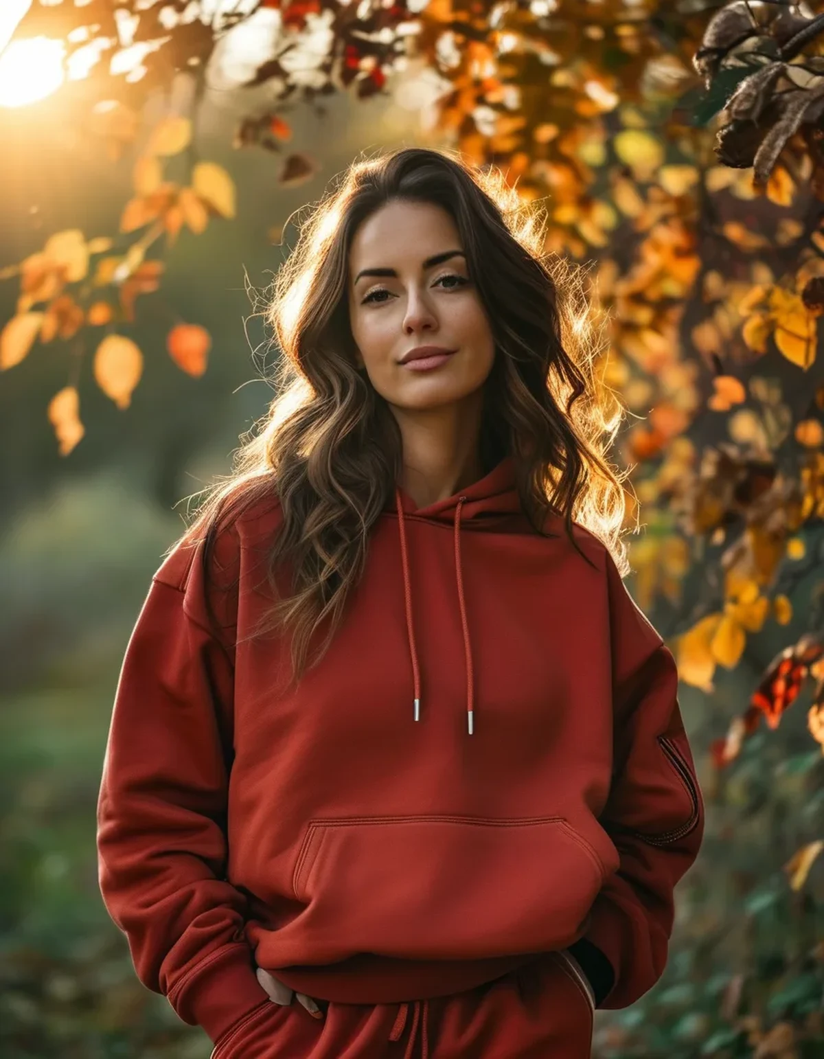
Change 2 - Add one warm-toned piece. Rust, burnt orange, olive, camel, burgundy, mustard, or deep terracotta. One item is enough - a jacket, a sports bra, a pair of leggings. The warm tone signals the season and lets everything else stay as it is.
Change 3 - Change the shoes. Light or white trainers read summer; darker trainers, deeper colours, or anything in a warm neutral read autumn. Shoes anchor the bottom of an outfit and they are the most overlooked seasonal signal.
A fourth, optional but effective: add texture. A ribbed, brushed, or heavier-weight layer over a summer-weight piece does seasonally what colour does, and the two together are more convincing than either alone.
Notice what is not on the list: buying new colours. Three changes, all using pieces most people already own, and a summer palette carries through October.
Which summer colours transition well, and which do not?
Some colours cross seasons easily and some genuinely do not.
Transitions easily:
- Coral and warm pink. Warm undertones, so they sit naturally next to autumn tones.
- Teal and deep turquoise. Reads as jewel-toned against dark neutrals.
- Bright red. One of the most season-agnostic colours there is.
- Deep purple and plum. Already autumnal.
- Any bright, when paired with charcoal or black. The neutral does the transitioning.
Transitions with effort:
- Bright yellow. Works beside olive, brown or charcoal; looks distinctly summer beside white.
- Cobalt blue. Needs a warm or deep neutral next to it.
- Bright green. Works if it leans toward olive; struggles if it leans toward lime.
Genuinely hard:
- Pastels - mint, powder blue, lilac, buttercup. Cool, light, and low-saturation, which is the exact opposite of the autumn palette. They can be layered under something deeper rather than shown on their own.
- White-on-white. Wearable and unambiguously summer.
- Neon in cool tones, like electric lime, which is difficult to place in autumn context.
The pattern: warm undertones and higher saturation transition; cool undertones and lightness do not. If a colour is struggling, it is almost always one of those two properties.
What Nobody Tells You About Seasonal Colour
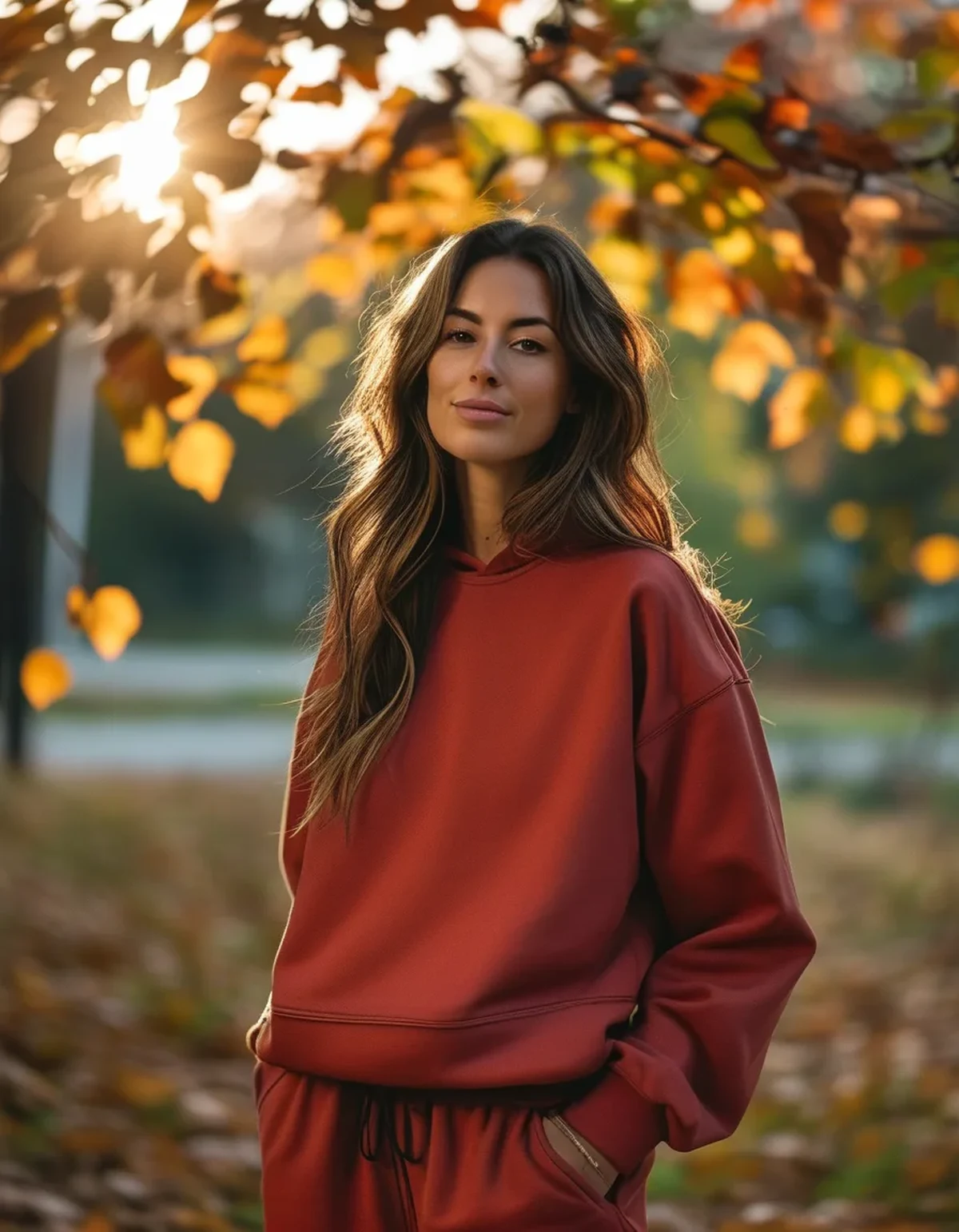
Autumn palettes are lower in contrast, not just darker. Summer styling uses high contrast - bright against white. Autumn styling uses closer tonal relationships - rust with brown, olive with camel. Lowering the contrast in an outfit does as much seasonal work as changing the colours.
Saturation matters more than hue for seasonal feel. A muted version of any colour reads more autumnal than a bright version of an autumn colour. A dusty pink reads more like October than a bright orange does.
The season does not actually have rules, it has conventions. Nobody will stop you wearing mint in November, and there is a reason it feels off - it is an expectation, not a law. Wearing it deliberately, with dark neutrals and warm accents, reads as intentional rather than out of season.
Black activewear fades unevenly and it shows most in autumn, when you are wearing more of it. Wash inside out, cold, and skip fabric softener - faded black next to true black is more visible than any colour mismatch.
Dark colours show sweat more visibly than mid-tones, which is worth knowing as you shift the palette down. Charcoal and heather grey are the worst offenders; true black and deep navy are the most forgiving.
And the end-of-season timing point: bright and pastel activewear is heavily discounted right now precisely because it is going out of season. If a colour transitions well - coral, teal, red - buying it at a deep discount in August for wear in October is straightforward value. The discount reflects the retailer’s storage problem, not the wearability.
What are five combinations to just copy?
1. Any bright top + charcoal leggings + dark trainers. The universal fix. Works with literally any summer colour you own.
2. Rust or burgundy sports bra + black leggings + oversized grey sweatshirt. One warm piece doing all the seasonal signalling.
3. Olive jacket + any summer-coloured top underneath + black bottoms. The layered version - the summer colour becomes an accent rather than the statement.
4. Pastel top + camel or chocolate brown layer over it + dark leggings. The rescue combination for pastels, which otherwise struggle. The warm neutral pulls them into the season.
5. Full black or charcoal set + one bright accessory or shoe. The minimal-effort autumn look, with a summer colour used deliberately as a single accent.
Across all five: deeper neutral on the bottom, one warm or deep element, darker shoes. No new colours required - just a different arrangement of what is already in the drawer.
FAQ: Seasonal Activewear Colour Questions, Answered
Do I need to buy new activewear for autumn?
No. Changing the neutral you pair with, adding one warm-toned piece, and swapping to darker shoes handles the transition with what you already own.
Which colours are worth buying now on sale?
Warm-toned brights that transition well - coral, red, teal, plum - are the best value, because they are discounted as summer stock and wearable through autumn.
Can I wear pastels in autumn?
Yes, layered under or beside deeper warm neutrals. Worn alone with white, they read distinctly out of season.
Why does my black activewear look faded?
Repeated washing, heat, and fabric softener. Wash cold, inside out, no softener, no tumble dryer. Faded black is more noticeable than any colour clash.
Does colour actually matter for performance?
Only practically - lighter colours reflect heat outdoors and darker colours show sweat differently. Everything else about seasonal colour is aesthetic, which is a perfectly good reason to care about it.
TL;DR:
- Colour reads relationally - change what surrounds it rather than replacing it
- Swap white for charcoal, navy or brown; add one warm-toned piece; darken the shoes
- Warm undertones and high saturation transition well; cool pastels struggle without a warm layer
- Autumn styling is lower contrast, not just darker
- Coral, teal, red and plum are the best things to buy on end-of-summer clearance
Three changes, no new colours. The drawer is fine.
See It in Motion
Seen here: UPF 50+ Short Sleeve Rashguard Swim Shirt — shop it on bubblelime.com
Keep Reading
This article is for general informational and styling purposes only. Fit, sizing, and product availability may vary.