Beyond Black: Choosing Matching Set Colors You Won't Regret
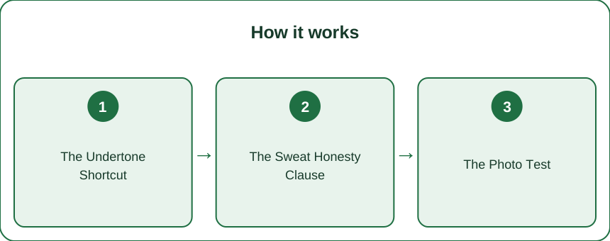
Quick Answer: Pick matching set colors in this order — undertone first (warm skin glows in sage, terracotta, cream, mocha; cool skin in dusty blue, berry, charcoal), then sweat honesty (light grey shows everything, so save it for low-sweat days), then the photo test, then buy one new color at a time that pairs with sets you already own.
The matching set solved the what-to-wear question and immediately created a new one.
Which color?
Black is safe. Black is also what your other four sets are. And every time you go to buy something else, you stand there for eleven minutes and buy black again.
Here’s the decision guide for going chromatic without buyer’s remorse — including the sweat honesty section that product photos never mention.
Which colors suit my skin tone?
Start with undertone, because it’s the one variable that doesn’t change.
The wrist test: look at the veins on the inside of your wrist in natural daylight.
- Greenish → warm undertone
- Bluish or purple → cool undertone
- Can’t tell / a bit of both → neutral undertone
Cross-check with jewelry: if gold consistently looks better on you, you’re warm. If silver does, you’re cool. If both look fine, neutral.
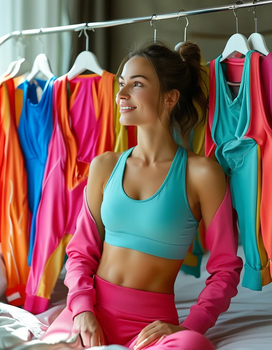
Warm undertones glow in: sage, olive, terracotta, rust, cream, mocha, camel, warm coral, mustard. These share a golden or earthy base that echoes the warmth in your skin.
Cool undertones shine in: dusty blue, berry, plum, charcoal, true grey, emerald, cool pink, navy. Blue-based colors sit against cool skin without fighting it.
Neutral undertones won the lottery — genuinely almost everything works, so you can choose purely on preference.
The one universal caveat: any color that’s very close to your own skin tone will wash you out regardless of undertone. Contrast is what makes a color read as flattering, so if you’re pale and considering a pale beige set, hold it up to your face first.
And the practical shortcut: hold the item next to your jawline in daylight, not shop lighting. Your face either looks brighter or slightly grey. That’s the whole test, and it takes four seconds.
Which activewear colors hide sweat?
This is the section product photography never shows you, and it’s not negotiable physics.
Light grey — specifically grey marl or heather grey — is the most beautiful color in the store and the most honest about your workout. The light base plus the moisture-darkening effect means every sweat mark shows immediately and dramatically. This is not a fabric quality issue; it happens to expensive sets too.
Colors that hide sweat well:
- Black, charcoal, navy, deep olive — the reliable darks
- Rich mid-tones — rust, berry, forest, deep teal
- Heathered darks — the texture breaks up any patches
- True brights — a saturated cobalt or coral darkens less visibly than a pastel
- Prints and patterns — the best sweat camouflage available
Colors that show everything:
- Grey marl (the worst offender by a wide margin)
- Pale blue, lilac, blush, mint — any light pastel
- Light heathered anything
- Cream and off-white
Match the color to the activity, not the aesthetic:
- High sweat (running, HIIT, hot yoga, spin) → darks, heathered darks, true brights, or prints
- Moderate (strength training, general gym) → most colors work
- Low sweat (pilates, walking, errands, working from home) → this is where grey marl and pastels belong
Grey marl belongs to low-sweat days and Instagram. A squat-proof high waist legging in black or deep olive is the one that goes to the actual workout.
Will this color photograph well?
Sets get photographed. This is simply the law now, and it’s worth two minutes of consideration before you spend $80.
Photographs beautifully: rich mid-tones. Sage, rust, navy, terracotta, deep teal, plum. These hold their color across most lighting conditions and read as intentional rather than accidental.
Struggles on camera:
- Ultra-pale sets wash out, especially in bright daylight, and often merge with the background
- Neon and fluorescent colors fight the camera’s white balance and can throw color casts onto your face
- True white blows out in sunlight and picks up every shadow indoors
Gym lighting is its own problem. Overhead fluorescents cast green and cool tones, which is unkind to warm colors and to pale skin. If the set is primarily for the gym, that’s an argument for darks and saturated mid-tones.
The four-second audition: if the set will attend brunch, a walk, or anything that ends in photographs, take one shot in your phone camera in the shop mirror before you buy. You’ll know instantly, and it costs nothing.
How do I build a set collection without wasting money?
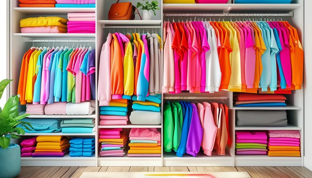
One new color per purchase, chosen to pair with what you already own. That’s the entire strategy.
Here’s the math that most people miss: sets don’t have to stay matched. Two sets bought to coordinate give you four outfits — sage top with sage bottom, mocha with mocha, sage top with mocha bottom, mocha top with sage bottom.
Two sets bought at random, in colors that clash, give you two outfits. Same money, half the wardrobe.
Practical rules:
- Start with one dark neutral — black, charcoal, or navy. This is your workhorse and it pairs with everything.
- Add a mid-tone that suits your undertone — sage or terracotta for warm, dusty blue or berry for cool.
- Third purchase: something that pairs with both of the first two. Check by imagining the mix-and-match combinations, not just the set.
- Keep the whole collection inside one temperature family. Warm colors together, cool colors together. Cross the streams and half your combinations stop working.
- Only then buy the tangerine, if you still want it.
Random rainbow collecting produces zero cross-combinations. The capsule math never sleeps, and it applies as much to activewear as to a work wardrobe.
5 Mistakes Everyone Makes Buying Colored Sets
- Buying grey marl for high-sweat workouts. It looks incredible on the hanger and lasts eleven minutes into a run.
- Judging color in shop lighting. Retail lighting is engineered to flatter. Daylight or a window is the honest test.
- Buying a color close to your own skin tone. Contrast is what makes color flattering — matching your skin washes you out.
- Collecting colors that don’t cross-pair. Four sets, four outfits, when it could have been sixteen.
- Buying the trend color first. The one that ends up unworn — build the neutral base, then the mid-tones, then the statement.
FAQ
What color leggings are most flattering?
Black and charcoal are the most universally flattering because they read as clean and uninterrupted, and they suit every undertone. Beyond the neutrals, choose by undertone: deep olive and terracotta for warm skin, navy and plum for cool. Solid colors are more flattering than large prints for most people, since the print’s shapes distort with the fabric.
Do dark colors really hide sweat better?
Yes, meaningfully. Wet fabric darkens, so the color change is far less visible on an already-dark base. Black, charcoal, and deep navy are the best performers; heathered darks and prints are close behind because the existing texture disguises patches.
How do I know my skin undertone?
Check your wrist veins in natural light — green means warm, blue or purple means cool, a mix means neutral. Cross-check with jewelry: if gold looks better on you than silver, you’re warm. If both work equally, you’re neutral and can wear almost anything.
Should all my activewear match?
It’s more useful if it coordinates than if it strictly matches. Keep everything in one temperature family — all warm or all cool — and every top will work with every bottom, which multiplies your outfits without multiplying your purchases.
TL;DR:
- Undertone first: warm → sage, terracotta, cream, mocha. Cool → dusty blue, berry, charcoal
- Wrist veins green = warm, blue = cool. Gold vs silver confirms it
- Grey marl shows everything. Save it for low-sweat days; darks, brights, and prints for real workouts
- Photo test: rich mid-tones win; pale washes out and neon fights the camera
- One new color per purchase, chosen to cross-pair with what you own
- Stay inside one temperature family — two coordinating sets = four outfits
The matching set was already the easy button. Now the color is too. Black will survive the diversification.
Keep Reading
This article is for general informational and styling purposes only. Fit, sizing, and product availability may vary.