How to Move Your Activewear Colours Into Autumn Without Buying Anything
Quick Answer: You don’t need autumn-coloured activewear to make summer pieces work in autumn - you need to change what surrounds them. Swap cool neutrals (white, cool grey, black) for warm ones (cream, camel, chocolate, olive), reduce the number of colours per outfit from three to two, and let the brightest piece sit under a neutral layer rather than on top. Same wardrobe, entirely different season.
The coral set that looked right in July looks slightly out of place in October, and it isn’t the coral’s fault.
Colour reads seasonally because of context. Change the context and the same pieces work.
Why do summer colours look wrong in autumn?
Two things change, and neither is the garment.
The light changes. Autumn sun sits lower and its light has a warmer cast, and days are increasingly overcast. Bright cool colours look flat and slightly harsh under lower, warmer light - the same coral that glowed under high summer sun goes chalky under October cloud.
The surrounding palette changes. Everything around you shifts: trees, other people’s clothing, interiors. A bright colour that sat comfortably among other bright colours in July looks isolated against a muted autumn backdrop.
Which colours suffer most: cool pastels, neon, and stark white. Which survive easily: anything with warmth in it - coral, terracotta, mustard, warm turquoise, and the whole olive-to-rust range.
The critical point: this is about relationship, not about the colour itself. A bright pink next to white and cool grey reads as summer. The same pink next to cream and chocolate reads as autumn. You’re changing the frame, not the picture.
Why this saves money: most people respond by buying an autumn-coloured set. The pieces you own mostly work already - the neutrals you pair them with are what’s dating the outfit.
What are the three changes that do the work?
In order of impact.
1. Swap cool neutrals for warm ones. The single biggest change.
- White becomes cream or ecru
- Cool grey becomes taupe or camel
- Black becomes chocolate, olive, or charcoal
Warm neutrals harmonise with autumn light, and they make a bright colour look intentional rather than left over. Cream against coral is autumn; white against coral is July. Try it once with a piece you already own and the difference is immediately obvious.
2. Reduce from three colours to two. Summer outfits tolerate more colour because the light and environment support it. Autumn outfits look better with less - one colour plus one neutral, or two closely related colours.
The practical version: if a summer outfit was bright top, bright legging, white shoe, the autumn version is bright legging, neutral top, neutral shoe. One point of colour instead of three.
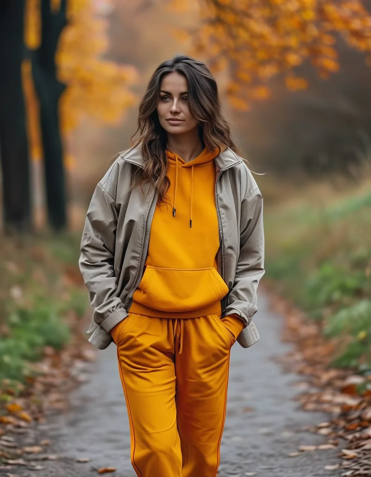
3. Move the bright piece under a layer. A bright top under an open neutral jacket reads completely differently from the same top alone. The layer frames the colour and reduces the visible area of it - which is the whole mechanism, and it takes no shopping at all.
A fourth, optional change: consider fabric. The same colour reads more autumnal in a heavier or more textured fabric - a ribbed or brushed piece in bright coral looks more seasonal than a shiny lightweight one, because texture carries seasonal association as strongly as colour.

Which colours actually carry through the whole year?
The reliable ones, worth knowing before your next purchase.
Year-round performers:
- Olive - reads as a neutral in practice and pairs with almost everything
- Burgundy and wine - autumn-native and works in spring
- Navy - a warmer alternative to black that doesn’t date
- Rust and terracotta - peak autumn and perfectly good in summer
- Cream - the most useful neutral in activewear, and underused
- Chocolate and warm brown - has become far more common in activewear and pairs beautifully with brights
Summer-limited:
- Pastels, particularly cool ones - these read most strongly as one season
- Neon - works in autumn only as a small accent
- Stark white as a full outfit - fine as a piece, difficult as a whole look after September
The buying implication: if you’re adding pieces, buy the neutrals in warm tones and the colour in the year-round list. A cream jacket and an olive legging will work harder across twelve months than any seasonal set.
On black specifically: it’s the default activewear colour and it isn’t the most flattering neutral in autumn light. Chocolate, charcoal and deep olive photograph better and look softer against most skin tones, and they pair more easily with the brights you already own.
One practical test before buying anything: hold it against two pieces you actually own. A colour that only works with things you’d have to buy isn’t a bargain.
5 Mistakes in the Seasonal Colour Transition
The recurring ones.
1. Retiring bright pieces entirely. They work all year with different neutrals, and putting half your wardrobe away for six months is an expensive habit built on a false premise.
2. Buying a full autumn set instead of one neutral layer. A cream or camel jacket transforms everything you own. A new autumn-coloured set changes one outfit.
3. Keeping white as the default neutral. The most common and least noticed. Cream does the same job and looks correct for eight more months of the year.
4. Wearing three colours in autumn light. What looked lively in July looks busy in October. Two is the working maximum, and one plus a neutral is often better.
5. Matching the exact same set top and bottom in a bright colour. A head-to-toe bright is a summer proposition. Splitting the set - bright legging with a neutral top - keeps the piece in rotation without the whole look reading as off-season.
The general principle behind all five: autumn styling is subtractive. You’re reducing the number of colour statements, not replacing them with different ones.
FAQ: Activewear Colour Questions, Answered
Can I wear neon in autumn?
As an accent, yes - a neon shoe detail or a stripe works. As a full piece it fights the light. If you love a neon top, layering it under a neutral jacket keeps it in rotation with a much smaller visible area.
What’s the single most useful colour to add?
A warm neutral outer layer - cream, camel, or olive. It works with every bright you own and immediately shifts the season of any outfit. It does more than any additional colour piece.
Do dark colours actually suit autumn better?
Not inherently - warm colours suit autumn light better, and many of those are dark. A bright rust reads more autumnal than a cool navy despite being lighter. It’s temperature of colour rather than depth that matters.
Why does my black activewear look faded in autumn light?
Black fades genuinely with washing and sun exposure, and lower autumn light shows the resulting greyish cast more clearly. Washing inside out in cold water slows it. If a black piece has gone grey, pairing it with charcoal rather than true black makes it look intentional.
Should I match my leggings and top?
Matching sets look strongest in neutrals and in muted colours. In a bright colour, a full matching set reads as summer or as a gym-specific outfit. Splitting the set is the easiest way to extend both pieces across more of the year.
TL;DR:
- Summer brights don’t stop working - the cool neutrals you pair them with are what dates the outfit
- Swap white for cream, cool grey for camel, black for chocolate or olive
- Reduce from three colours to two; autumn styling is subtractive
- Put the bright piece under a neutral layer rather than on top
- Year-round colours: olive, burgundy, navy, rust, cream, chocolate
- One warm neutral jacket does more for your wardrobe than a whole new autumn set
You probably don’t need new activewear. You need a cream jacket.
See It in Motion
Seen here: High Waist Yoga Leggings with Side Pockets — shop it on bubblelime.com
Keep Reading
This article is for general informational and styling purposes only. Fit, sizing, and product availability may vary.