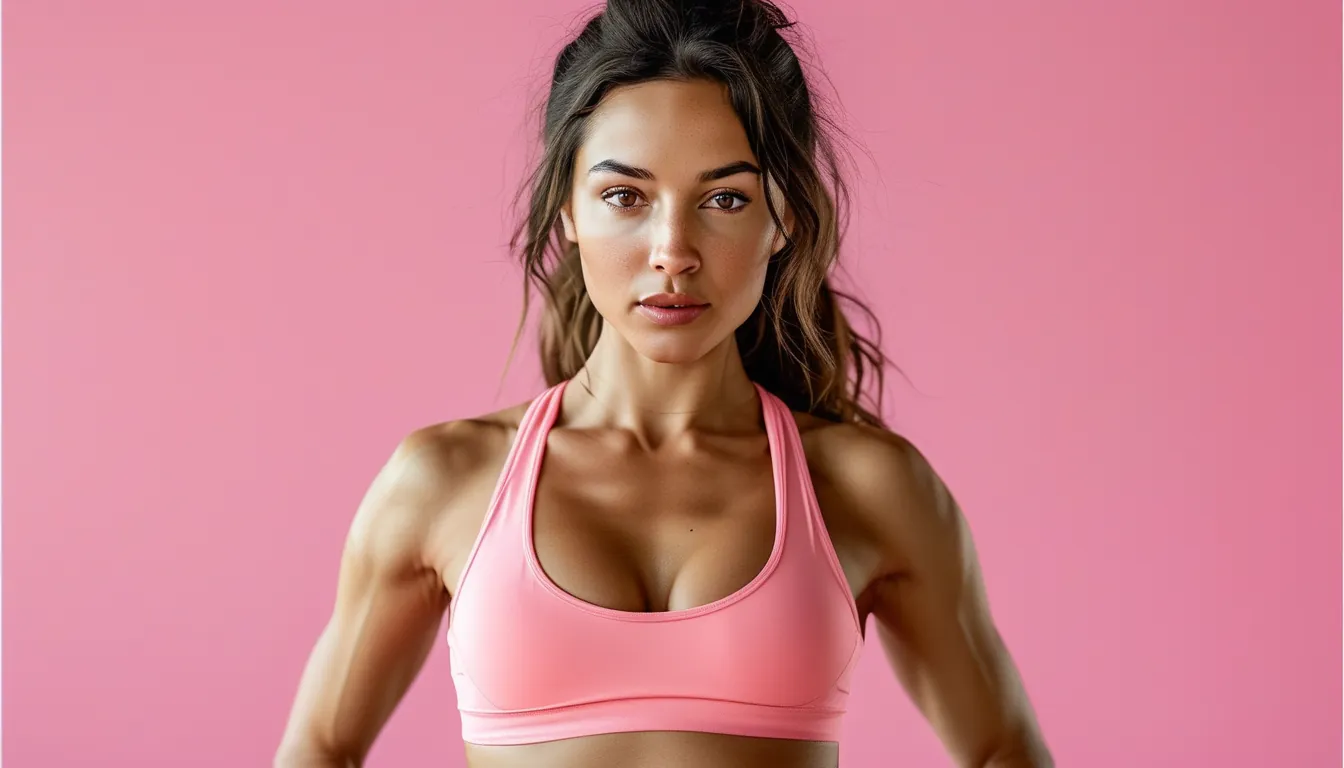
Why Your Activewear Looks Completely Different Under Gym Lighting
Quick Answer: Light sources differ in colour temperature and in how completely they render colours. Warm home lighting flatters reds and neutrals, cool gym LEDs strip warmth and exaggerate blue and green, and fluorescent tubes with poor colour rendering flatten everything in between. Colours that shift most are the ones sitting between categories - mauve, olive, dusty pink, teal. Solid saturated colours and true neutrals hold up almost anywhere.
If a colour looks different in three rooms, the colour is not the problem. It is sitting in the range where light sources disagree most.
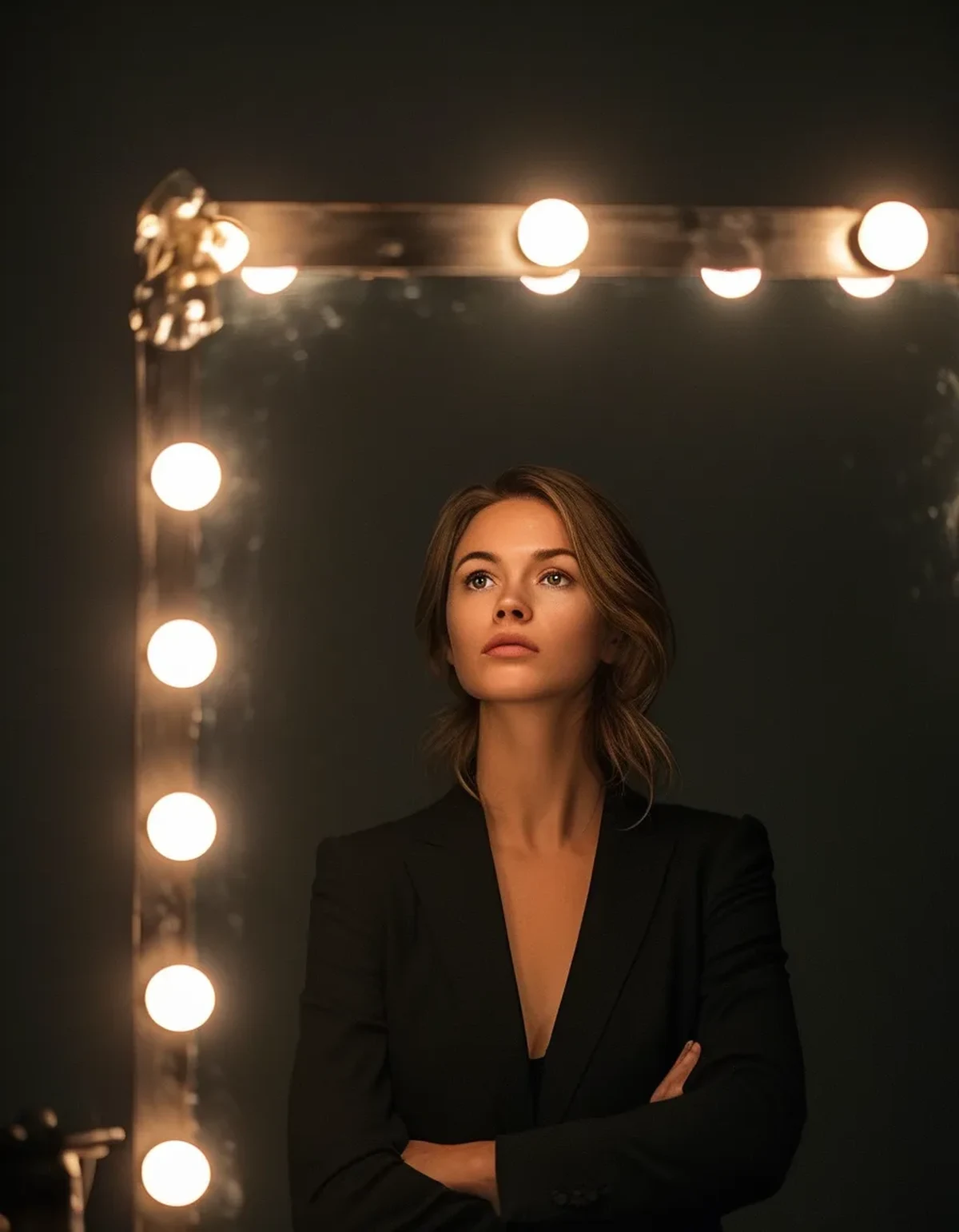
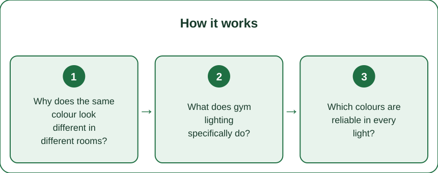
Why does the same colour look different in different rooms?
Because a colour is a reflection, not a property. You see whatever wavelengths a fabric reflects out of whatever the light source provided.
Colour temperature is the first variable. Measured in kelvin, it describes how warm or cool a light source is.
- Warm home lighting, around 2700K, is heavy in red and yellow wavelengths. It flatters warm colours and dulls cool ones
- Neutral or daylight-balanced lighting, around 4000 to 5000K, is what most gyms and studios use
- Cool daylight LEDs, 5000K and above, push blue. They make cool colours pop and make warm colours look flat or greyish
Colour rendering is the second and less known variable. The colour rendering index describes how faithfully a light source reproduces colours compared with natural light. A high-CRI source shows colours accurately; a low-CRI source can leave whole ranges looking dull or shifted. Older fluorescent tubes and cheap LEDs often have poor rendering, which is why some changing rooms make everything look slightly ill.
Which colours shift most:
- In-between colours - mauve, dusty rose, olive, teal, taupe. They sit near the boundary between categories, so a small shift in the light moves them across it
- Anything with a subtle undertone, which is precisely what makes those colours interesting at home
Which hold steady:
- True black, true white, and mid-grey
- Saturated primaries - a strong red, a strong blue, a strong green
- Navy, which is reliably navy nearly everywhere
The practical implication: if you want a set that looks the same at home, in the studio, and in a photo, buy saturated or neutral. If you love the subtle colours, accept that they will read differently in different rooms.
What does gym lighting specifically do?
Three things, and they combine unhelpfully.
It is usually cool and overhead. Most gyms run cool white or daylight-balanced LEDs mounted in the ceiling. Cool temperature strips warmth from colours, and overhead placement casts shadows downward - which is why gym mirrors are widely considered unflattering. The lighting is optimised for visibility and energy efficiency, not for how anyone looks.
Studio lighting is often warmer and dimmer, particularly in yoga and pilates spaces, which is deliberate. Warm dim light flatters warm tones and skin, and it makes cool colours - particularly pale blues and mint - look grey and lifeless.
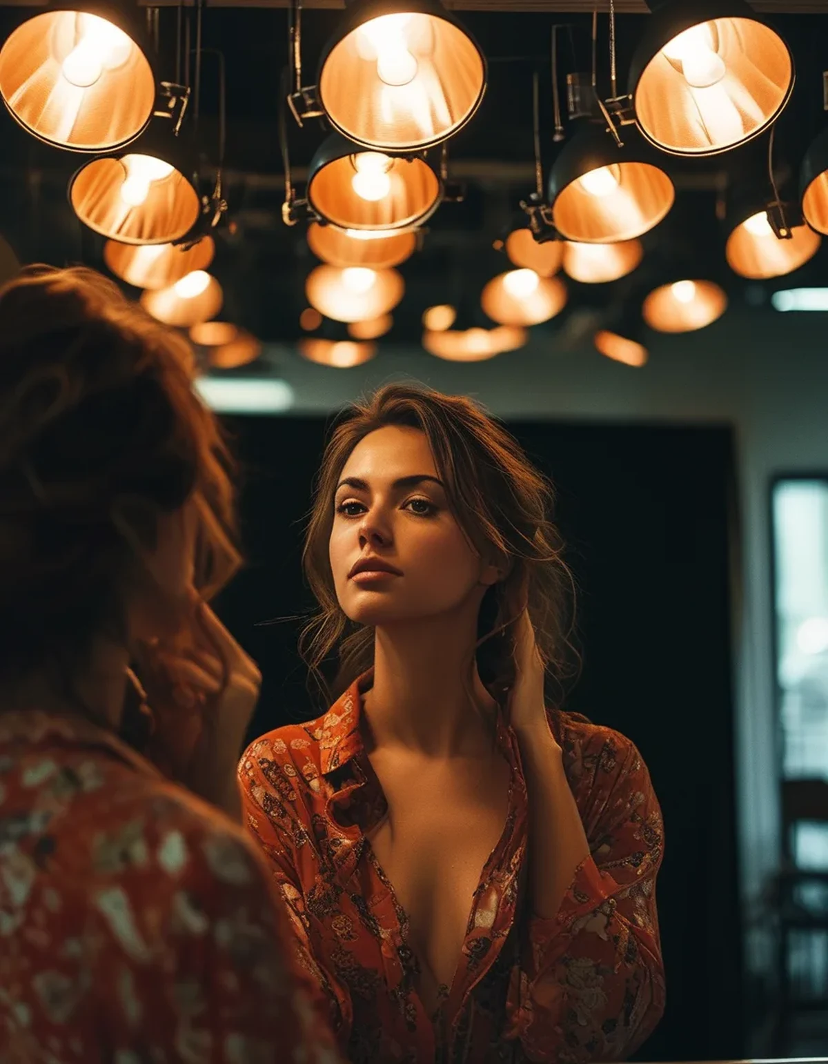
Mirrors add their own tint. Standard mirror glass has a slight green cast from the iron content in the glass, which is why almost everything looks marginally cooler and greener in a mirror than in reality. In a long mirror with multiple reflections, the effect compounds.
What this means for specific colours:
- Warm colours - coral, rust, warm pink, mustard - look excellent in warm studio lighting and can look flat and muddy under cool gym LEDs
- Cool colours - true blue, mint, lilac, cool grey - pop under gym LEDs and look washed out in warm studios
- Olive and khaki are the most volatile of all. Under warm light they read brown; under cool light they read distinctly green
- White picks up whatever the source is doing, which is why gym whites often look slightly blue or slightly yellow rather than white
The one genuinely useful adjustment: if you train mostly in one space, buy for that space. It sounds obvious and almost nobody does it.
Which colours are reliable in every light?
A short list, and it is why so many people end up in black.
The consistently reliable:
- Black. Reads as black under everything, which is most of its appeal. The failure mode is fading to a slightly brown or grey cast, and once faded, it becomes inconsistent
- Navy. Nearly as reliable, and warmer and softer than black in photos
- Charcoal and mid-grey. Stable, though grey picks up colour casts from surroundings more than black does
- True saturated red, cobalt, emerald. Strong enough that a shift in light does not move them into another category
- Cream and warm white, which are more forgiving than bright white under mixed lighting
The consistently unpredictable:
- Mauve, dusty rose, blush. Beautiful in warm light, grey under cool light
- Olive, sage, khaki. The most volatile category in this whole subject
- Teal and petrol. Reads blue in some light, green in others, which is why people disagree about what colour a teal legging actually is
- Taupe and greige, which pick up whatever cast is available
- Pale pastels generally, which have too little pigment to hold their own
A useful buying test, whether online or in a shop: look at the colour in at least two different lights before deciding. In a shop, take it to a window - daylight is the reference point everything else is deviating from. Online, look at multiple photographs from different angles, and treat product photography, which is lit deliberately to flatter, as the least reliable source.
On matching sets specifically. Two pieces dyed in different batches or on different fabrics can match perfectly in one light and visibly mismatch in another, because different fabrics reflect light differently even at the same dye colour. This is metamerism, and it is the reason a top and legging bought together sometimes stop matching under gym lights - neither piece has changed.
Myth vs Fact: Activewear Colour and Light
Myth: If a colour looks wrong in the gym mirror, the colour is unflattering on you. Fact: Gym mirrors combine cool overhead LEDs with a slight green cast in the glass. That combination is unflattering to almost everyone and almost every colour.
Myth: Black always looks the same. Fact: New black does. Faded black shifts toward brown or grey and then becomes as light-dependent as anything else, which is why an old black set can suddenly look off next to a new one.
Myth: If two pieces match in the shop they will match everywhere. Fact: Different fabrics reflect light differently even at the same dye colour. A top and legging that match under shop lighting can visibly mismatch under gym LEDs.
Myth: Phone cameras show the true colour. Fact: Phone cameras apply automatic white balance and heavy processing, and they often adjust for the dominant light source in a way your eye does not. A phone photo is a fourth lighting condition, not a neutral record - which is the thing most people never account for when they hate how a set photographs.
Myth: Expensive activewear has more consistent colour. Fact: Consistency is a function of dye process and fabric, not price. What price often buys is better colourfastness over time, which is a different and genuinely valuable thing.
Myth: Neutral colours are always safe. Fact: True neutrals are. Near-neutrals - taupe, greige, sage - are among the least stable colours there are.
How should this change what you buy?
Buy for the room you actually train in, and treat the subtle colours as a deliberate choice rather than a default.
If you train mostly under cool gym LEDs:
- Cool and saturated colours perform best. Cobalt, true red, emerald, black, navy, cool grey
- Avoid pale warm tones, which go flat. Blush, peach, and warm cream lose most of their character
- Olive reads green here, which may be what you want or may not
If you train mostly in a warm-lit studio:
- Warm colours come alive. Rust, coral, warm pink, mustard, chocolate, cream
- Cool pastels struggle - mint, powder blue, and lilac go grey
- Black and navy are still fine, and navy in particular looks softer and richer in warm light
If you train outdoors, which is the easiest case: daylight has excellent colour rendering and everything reads as it was designed to. This is the reference condition. Anything that looks good outdoors is a genuine colour; anything that only works in one indoor room is being flattered.
If you photograph your workouts or care how sets look in photos:
- Saturated mid-tones photograph most reliably
- Very dark and very light both lose detail, which is a camera limitation rather than a colour one
- Take one test photo in your usual space before buying more of the same colour. Two minutes, and it prevents a whole drawer of sets that only work in person
One last practical point about fading. Colour consistency degrades over time, and it degrades unevenly - synthetics fade differently from cotton blends, and high-friction areas fade first. Washing cold, inside out, without softener, and drying out of direct sun preserves colour far more than any purchase decision does. A well-cared-for mid-price set holds its colour longer than a badly-washed expensive one.
FAQ: Activewear Colour Questions, Answered
Why does my activewear look different at the gym than at home?
Home lighting is usually warm, around 2700K, and gyms usually run cool 4000 to 5000K LEDs. The light source determines which wavelengths are available to reflect.
Which colours are most reliable across lighting?
Black, navy, charcoal, cream, and strongly saturated colours like true red, cobalt, and emerald. Near-neutrals such as sage, taupe, and mauve are the least stable.
Why do my matching top and leggings sometimes not match?
Different fabrics reflect light differently at the same dye colour, so a pair that matched under one light can visibly mismatch under another. Nothing has changed in the garments.
Are gym mirrors actually unflattering?
Yes, fairly reliably - cool overhead lighting plus the slight green cast in standard mirror glass is a combination that flatters nobody.
Should I judge a colour by phone photos?
With caution. Phone cameras apply automatic white balance and processing, so a photo is a separate lighting condition rather than a neutral record.
TL;DR:
- Colour is a reflection of whatever the light source provides, so colour temperature and rendering change what you see
- Cool gym LEDs strip warmth; warm studio lighting flattens cool tones; mirror glass adds a slight green cast
- Black, navy, charcoal and saturated primaries hold up everywhere - sage, taupe, mauve and teal are the least stable
- Matching sets can mismatch under different lights because different fabrics reflect differently at the same dye colour
- Buy for the room you actually train in, and check any colour in daylight before deciding
If a colour only works in one room, it is being flattered rather than looking good. Daylight is the honest reference.
See It in Motion
Seen here: Super High Waist Embossed Yoga Leggings with Inner Pocket — shop it on bubblelime.com
Keep Reading
This article is for general informational and styling purposes only. Fit, sizing, and product availability may vary.