Why Activewear Colours Never Match the Website Photo
Quick Answer: The colour changes at six points: studio lighting, camera white balance, retouching, the colour profile of the image file, your own screen calibration and brightness, and the light in your room. No two of those are standardised. The workarounds that help most are checking customer photos rather than product shots, viewing on a phone rather than a laptop, and looking at the product on more than one retailer’s site.
You ordered sage. What arrived is a slightly sad grey-green that looks nothing like the photo. It is not dishonesty, or at least it usually is not - it is a chain of six translations, none of which agree with each other.
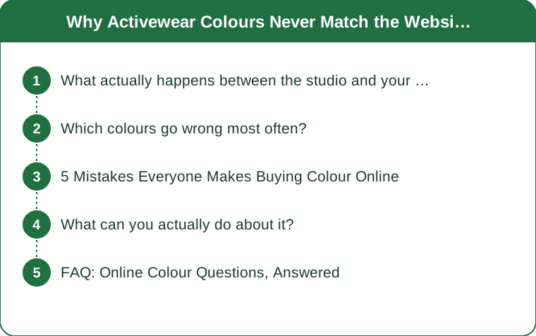
What actually happens between the studio and your screen?
Six stages, each of which shifts the colour.
1. Studio lighting. Product photography uses controlled artificial lighting, typically much brighter and often warmer or cooler than domestic light. A colour photographed under 5500K studio strobes looks measurably different to the same fabric under a household bulb at 2700K.
2. Camera white balance. The camera decides what counts as neutral in the scene. Even a small white balance shift moves every colour in the frame, and it particularly affects the muted, low-saturation shades that activewear brands favour - sage, taupe, dusty rose, mushroom. Highly saturated colours survive it better.
3. Retouching. Images are edited for appeal. Contrast and saturation are commonly lifted, which makes a colour look richer than it is. This is where product photos and reality diverge most.
4. Colour profile and compression. Images are saved in a colour space - sRGB, Adobe RGB, Display P3 - and if the profile is not embedded or is misinterpreted by the browser, colours shift, sometimes noticeably. Compression for fast page loading degrades subtle gradients too.
5. Your screen. Uncalibrated screens vary enormously. Phone displays are generally more saturated and often warmer than laptops. Night-shift or blue-light filters shift everything warm. Brightness settings change perceived saturation. Cheap laptop panels cannot even display the full sRGB range.
6. Your room. Warm bulbs make blues look grey. North-facing daylight is cool and makes warm colours look dull. This is the stage nobody accounts for, and it is why the garment looks different when you open the parcel in the hallway.
Which colours go wrong most often?
Not all of them fail equally, and knowing which categories are risky lets you shop accordingly.
Highest risk:
- Muted mid-tones - sage, olive, taupe, mushroom, dusty rose, mauve. These sit near the point where small shifts change the perceived hue family entirely. Sage can read as grey, green, or blue-green depending on everything downstream.
- Anything described as neutral. Neutrals are defined by their undertone, and undertone is exactly what survives this process worst.
- Deep jewel tones near the boundary between families - a teal that could be blue or green, a plum that could be purple or brown.
- Heather and marl blends, where two fibre colours mix optically and the result depends heavily on rendering.
Lowest risk:
- True black, white, and mid grey - though black activewear varies in whether it is warm or cool black, which matters if you are matching pieces.
- Saturated primaries - true red, royal blue, bright yellow. High saturation is robust to small shifts.
- Navy, usually, though it can arrive noticeably more purple or more black than expected.
And fabric changes it too. The same dye lot in matte compression fabric and in shiny performance knit reads as two different colours, because surface finish determines how much light is reflected versus absorbed. A product photographed in a ribbed texture will always look deeper than the same colour in a smooth flat knit.

5 Mistakes Everyone Makes Buying Colour Online
1. Judging from the model shot alone. Model photography is lit for the model and the composition, not for colour accuracy. The flat lay or the product-only shot on a plain background is closer to true - always look for it.
2. Ignoring customer photos. Reviews with photos are shot under ordinary domestic lighting on ordinary phones, which is exactly the environment you will be wearing the item in. Five customer photos are worth more than any studio image, and if they disagree with the product shot in the same direction, believe them.
3. Shopping with night mode on. Blue-light filters shift the entire screen warm. Anyone shopping in the evening with night shift enabled is looking at a systematically distorted palette. Turn it off before you buy, and set brightness to full.
4. Not cross-referencing. The same product on a brand site, a department store, and a marketplace will have three different sets of photos shot by three different teams. Where they agree, that is probably close to true. Where they disagree wildly, the colour is one of the risky ones. This takes ninety seconds and almost nobody does it.
5. Trusting the colour name. Sage, olive, and moss are marketing words with no standard definition, and one brand’s sage is another’s mint. The name tells you approximately nothing - the swatch, the customer photos, and the cross-reference tell you everything.
What can you actually do about it?
Both before ordering and after it arrives.
Before:
- View on a phone at full brightness with filters off. Phone screens are generally better calibrated than budget laptop panels.
- Look at the item next to a reference in the same photo if there is one - a white background, a black legging, a skin tone.
- Read reviews specifically for colour comments. People mention it constantly when it is wrong.
- If matching to something you own, assume you cannot do it online reliably. Matching black to black, or one sage to another, is the single hardest thing to get right remotely.
- Check the returns policy before ordering a risky colour, not after.
After it arrives:
- Judge it in daylight near a window before deciding, not under a kitchen bulb at 8pm. Indoor evening light is the least accurate viewing condition available.
- Look at it against your skin, not on the bed. Colour reads differently against skin than against a duvet.
- Try it with the pieces you meant to wear it with before deciding it is wrong. A colour can be different from expected and still work.
And if you keep having the problem: photograph pieces you already own in daylight and keep the images in an album. When you shop, compare against your own photos taken on your own phone - which removes several stages of the translation chain at once.
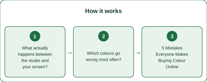
FAQ: Online Colour Questions, Answered
Why do clothes look different in person than online?
Studio lighting, camera white balance, retouching, colour profiles, your screen calibration, and your room lighting each shift the colour, and none of them are standardised across retailers.
How can I tell what colour something really is online?
Look at customer review photos rather than product shots, compare the same item across two or three retailers, view on a phone at full brightness with blue-light filters off, and treat colour names as marketing rather than description.
Which colours are hardest to buy online?
Muted mid-tones - sage, taupe, olive, dusty rose, mauve - and anything described as a neutral, because undertone is exactly what gets lost. Saturated primaries and true black are the most reliable.
TL;DR:
- Six translation stages sit between the fabric and your eye, and none of them agree.
- Muted mid-tones and neutrals fail most; saturated colours and true black survive best.
- Customer photos beat studio shots; cross-reference the item across two or three retailers.
- Shop at full brightness with night mode off, and judge the parcel in daylight.
The sage was never really sage. It was a photograph of sage, taken under lights you do not own, edited for a screen that is not yours.
Keep Reading
This article is for general informational and styling purposes only. Fit, sizing, and product availability may vary.