Why the Colors in Your Wardrobe Stop Working Together in Autumn
Quick Answer: Autumn daylight is cooler and flatter - overcast sky runs around 6500-7500K versus roughly 5500K for direct summer sun, and lower sun angle removes contrast. Cool light mutes warm colors and enriches cool ones, while flat light collapses the subtle contrast that made mid-tone combinations work. The fix is to increase contrast and depth rather than to change your palette.
The same two pieces, the same body, the same mirror - and somehow the outfit has gone flat. Nothing about the clothes changed. The light rendering them changed by more than a thousand kelvin.
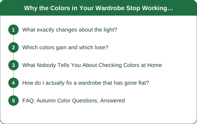
What exactly changes about the light?
Two properties, and they cause different problems.
Color temperature rises. Direct midday summer sun sits near 5500K, a fairly neutral white. Overcast autumn sky runs 6500-7500K, and open shade under a clear sky can go higher. Higher numbers mean more blue in the light. Blue-shifted light adds a cool cast to every surface it falls on, which enriches cool pigments and drains warm ones.
Light gets flatter. A lower sun travels through more atmosphere and increasing cloud cover scatters it, producing diffuse light with fewer highlights and softer shadows. Flat light reduces perceived contrast between adjacent surfaces.
The second effect causes more outfit problems than the first, and it is the one almost nobody thinks about. A combination of two mid-tone colors - a dusty rose top with a taupe trouser, say - relies on directional summer light to separate them visually. Under flat autumn light they collapse toward each other and the outfit reads as an indistinct mass.
Indoor lighting compounds it. As days shorten you dress and check yourself under warm artificial light around 2700-3000K, which is far warmer than the daylight you will actually be seen in. Getting dressed under a warm bulb and stepping into cool overcast light is a 4000K swing between the mirror and the street.
Which colors gain and which lose?
It follows directly from the cool cast.
Colors that gain in autumn light: cobalt and navy, emerald and forest green, magenta and berry, plum and aubergine, charcoal, and cool-toned grey. Cool light amplifies what is already cool in them, and they read deeper and more saturated than they did in summer.
Colors that lose: light coral, peach, marigold, lemon yellow, and pale warm pastels. Cool light works against their warmth and they read dusty, chalky, or slightly grey-green. This is why the summer pieces that felt luminous now look tired.
Colors that hold up regardless: deeply saturated warms - rust, brick, terracotta, ochre, camel, olive. These are interesting because they are warm and they survive. The reason is saturation and depth: a color with enough pigment density does not depend on warm light to read as warm. It carries its own. This is exactly why autumn palettes traditionally center on these shades, and it is a physical explanation rather than a fashion convention.
The practical rule: you do not need to abandon warm colors. You need to move from light warm to deep warm. Coral gives way to rust, marigold to ochre, peach to terracotta. Same family, more pigment.
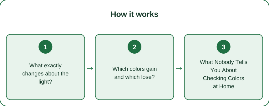
What Nobody Tells You About Checking Colors at Home
Almost every wardrobe color mistake traces back to evaluating a combination under the wrong light, and the fix is free.
Your bathroom mirror is lying to you. Bathroom and bedroom lighting is typically warm - 2700-3000K - and often positioned overhead, which flattens everything and casts downward shadows. Colors judged there will look different everywhere else you go that day. Warm bulbs make warm colors look better than they will and make cool colors look muddier than they are.
Check by a window, in daylight, facing the light. This is the single highest-value habit in this entire article and it takes ten seconds. North-facing windows give the most neutral light in the northern hemisphere. If a combination works by the window, it works outside.
Photograph it and look at the photo. Cameras compress tonal range, which exaggerates contrast problems - so a photograph reveals a muddy mid-tone pairing much faster than your eye does, because your visual system is actively compensating for the flat light in real time. If two colors merge into one shape in a photo, they will read that way to other people too.
Squint at your reflection. Squinting removes detail and leaves value structure. If your outfit becomes one undifferentiated shape when you squint, it lacks the contrast that autumn light will not supply for you.
Test in the actual conditions. If you dress for a school run and an office, check the combination in daylight and under fluorescent office light, which is usually cool and unflattering to warm tones in a completely different way. An outfit is not one color story - it is however many light environments your day contains.
How do I actually fix a wardrobe that has gone flat?
Three adjustments, none of which require replacing anything.
1. Increase value contrast. Value is lightness and darkness, independent of hue, and it is what flat light strips out. Pair a genuinely light piece with a genuinely dark one rather than two mid-tones. Cream with charcoal, ivory with navy, camel with deep brown. This is the fastest fix and it works with clothes you already own.
2. Add depth to your warm colors. Where you would have reached for a light warm shade, reach for its saturated cousin. If you own mostly light warm pieces, one deep warm addition - a rust knit, an olive jacket, a brick scarf - gives you a partner that makes the lighter pieces work again by supplying the contrast they lack on their own.
3. Use texture where color cannot carry it. Flat light removes contrast, and texture creates its own micro-shadows that survive diffuse light. A chunky knit, a corduroy, a ribbed fabric, or a suede reads as visually interesting even when the color relationship is subtle. This is the actual reason autumn wardrobes feel richer than summer ones - it is texture doing the work light used to do.
And one rule for shopping: do not buy clothes under store lighting, which is deliberately engineered to flatter. Take the item to a window or to a doorway if the shop has one, or buy from somewhere with a return policy and check it at home in daylight before removing tags. Retail lighting is designed to sell, and it is remarkably effective at making a color look like something it is not.
FAQ: Autumn Color Questions, Answered
Do I need to do a seasonal color analysis?
Not to solve this problem. Personal color analysis is about which hues suit your own coloring, which does not change with the seasons. What this article describes is about ambient light, which changes for everyone regardless of their coloring. The two are separate issues and the light one is the reason your combinations shifted this month.
Why does my black look different depending on what I pair it with?
Black garments are rarely truly neutral - dyes have undertones, and cotton, wool, and synthetic fibers take dye differently and fade differently. Two blacks with different undertones sitting next to each other make both look off, and flat autumn light makes the mismatch more obvious rather than less. Check blacks side by side in daylight, and it is usually easiest to keep a warm-black group and a cool-black group separate.
Should I just switch to a darker wardrobe for the season?
Darker is not required - more contrast and more depth is what you actually need. An all-dark wardrobe in flat light has the same problem as an all-mid-tone one, because it is also low in value contrast. A cream sweater over deep olive trousers is more visually alive on an overcast October day than an all-charcoal outfit is.
TL;DR:
- Autumn light is cooler (6500-7500K overcast vs ~5500K summer sun) and much flatter.
- Cool light enriches cobalt, emerald, plum and charcoal; it drains coral, peach and marigold.
- Deep saturated warms - rust, brick, ochre, camel - hold up because depth carries warmth without warm light.
- Fix it with value contrast, deeper warms, and texture - and always judge colors by a window, not under a warm bulb.
Nothing in your wardrobe stopped working. It is being viewed under light that is a thousand kelvin cooler and considerably flatter than the light it was chosen in. Add contrast where the light used to supply it, reach for the deeper version of the warm colors you love, and check by the window before you leave - it is a ten-second habit that fixes most of it.
Keep Reading
This article is for general informational and styling purposes only. Fit, sizing, and product availability may vary.