Why the Same Colour Reads Completely Differently on Top and on Bottom
Quick Answer: Four things are happening at once. Fabric weight and stretch change how much dye sits per square inch, so leggings stretched over the body read lighter and thinner in colour than an unstretched top. Surface texture changes reflectance - a ribbed or brushed knit scatters light and looks deeper than a smooth one. Light hits your torso and your legs at completely different angles, so the same colour is genuinely receiving different illumination. And the eye judges colour relative to what is next to it, so the same shade shifts depending on skin, shoes, and background. It is not a manufacturing fault, and the fix is choosing sets where the two pieces use the same fabric.
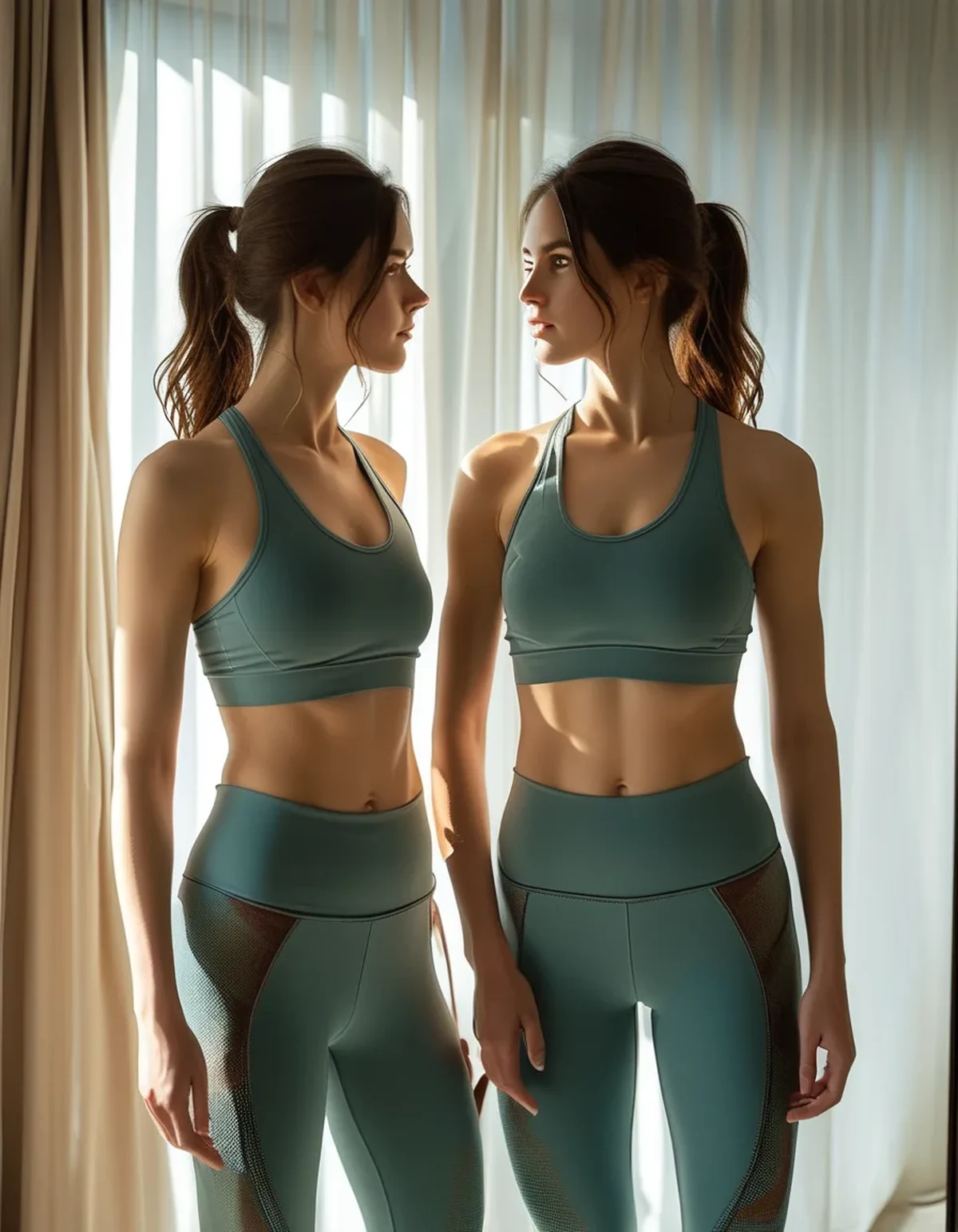
The photo showed one colour. In your bedroom mirror you are wearing two.
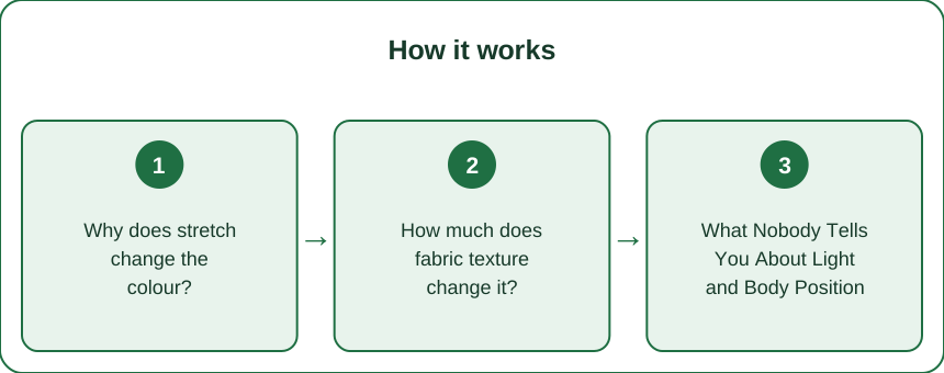
Why does stretch change the colour?
Because colour intensity depends on how much dyed fibre is in the light’s path, and stretch reduces that.
When a knit fabric stretches, the yarns pull apart, the loops flatten, and the fabric gets thinner. The dye is still on the fibres, but there is less fibre per square centimetre facing the light. The result is a lighter, slightly washed version of the same colour.
Leggings are stretched. Tops usually are not. A pair of leggings on the body is typically held at meaningful tension - that is how compression works - while a sports bra or a tee sits at much lower tension, and a loose top at essentially none. The same dye lot, the same fabric, worn at two different tensions, produces two visibly different shades.
Where you see it most: across the thigh and the seat, where stretch is highest. This is also why a colour can look uneven on a single pair of leggings - lighter over the fullest part of the thigh, deeper at the ankle where there is less tension. That gradient is physics, not a defect, though it is more visible in some colours than others.
Which colours show it worst. Mid-tone brights - cobalt, coral, emerald - show stretch lightening most clearly. Black shows it least, because there is nowhere lighter for black to go until the fabric becomes genuinely sheer. Pastels and light neutrals show it least in the other direction.
The sheer test is the same test. If a colour visibly lightens when you stretch it in your hands, it will look lighter on the body. That two-second check in the shop tells you more about how a garment will look than the swatch does.
How much does fabric texture change it?
More than dye does, in many cases - and this is the part people never suspect.
Colour is reflected light, so anything that changes how a surface reflects changes the perceived colour.
- Smooth, tightly knit fabrics reflect light specularly - some light bounces straight back - which lifts the apparent lightness and can add a slight sheen. Colours look brighter and slightly cooler.
- Ribbed knits create alternating raised and recessed lines. The recesses hold shadow. The overall reading is deeper and richer, and it changes with the direction you look at it from.
- Brushed or peached surfaces scatter light diffusely in every direction. This mutes the colour, softens it, and takes off any sheen. The same dye looks more matte and slightly lighter, but flatter.
- Mesh or perforated panels show whatever is behind them, which is usually skin. A mesh panel in the same colour as the body fabric always reads as a different colour on the body.
Why matching sets fail so often: brands frequently use a heavier, more compressive fabric for leggings and a lighter, softer one for the top - which is a sensible engineering decision and a colour problem. The dye is matched at the lab on flat fabric. The two garments then behave differently in weight, stretch, and surface, and diverge on the body.
The rule for buying: in a matching set, check whether both pieces list the same composition and the same fabric name. If the top is a lightweight jersey and the leggings are a heavyweight compressive knit, expect them to read as related rather than identical.
A useful reframe: two pieces that are close but not identical often look intentional if there is a clear tonal step. What looks like a mistake is the near-match, close enough that the eye reads it as a failed attempt rather than a choice.
What Nobody Tells You About Light and Body Position
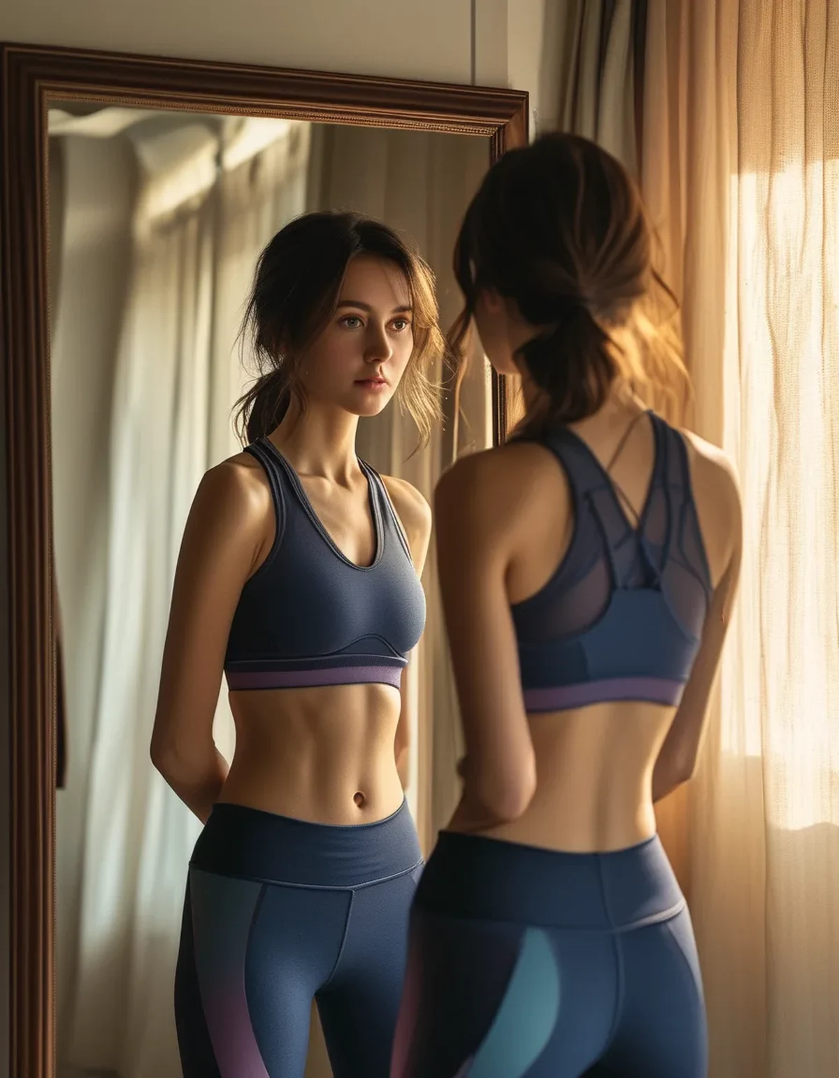
Your torso and your legs are lit differently in every room. Overhead light falls on horizontal-ish surfaces - shoulders, chest, the tops of thighs - and skims vertical ones. Your legs are more vertical than your torso and further from the light source, so your bottom half is genuinely receiving less light. A colour reads darker on the legs in most indoor lighting and this is real illumination, not perception.
Which is why the mirror lies differently than the photo. In a photo with a flash or a front-facing light, the illumination is far more even, so the two pieces match better on camera than in your bathroom. The website photo was lit deliberately to make them match.
Gym lighting is the worst case. Overhead fluorescent or LED panels create strong top-down light with a colour temperature that often sits well away from daylight. Colours with a lot of red or violet in them shift most under these lights, which is why some leggings look one colour at home and another in the changing room mirror.
Curvature matters. The more three-dimensional the surface, the more tonal variation you get across it. A round thigh has a lit side, a mid-tone, and a shadowed side, all in the same fabric. A flatter torso panel has less spread. Fitted bottoms will always show more tonal range than a loose top, in every colour.
Simultaneous contrast is doing something too. The eye judges a colour by its surroundings, so a mid-blue legging next to a light top looks darker than the same legging next to a dark top. Nothing about the garment changed. If a pairing looks wrong, try changing the other piece before rejecting the one you think is the problem.
And dye lots are a genuine variable. Even within one brand and one style, fabric dyed in different batches can differ slightly. Two pieces bought months apart in the same colour name are more likely to differ than two bought together.
How do you use this instead of fighting it?
The practical version turns the problem into a styling tool.
If you want a true match, buy sets where both pieces are the same fabric. Check the composition tag on both. Same fabric, same finish, same colour - the stretch difference remains but everything else lines up.
If a true match is not available, go deliberately tonal. Choose a bottom that is clearly one step deeper than the top, and the outfit reads as designed. Deeper on the bottom is the more natural direction because it echoes what light does anyway.
Use texture to control where the eye lands. A ribbed or brushed surface reads deeper and heavier; a smooth one reads lighter and brighter. Putting the higher-sheen fabric on the half you want noticed and the more matte one on the other half is the whole technique. Matte recedes, sheen advances.
Match at the hardest point, not the easiest. If you are pairing separates, hold them together in the light you will actually wear them in - your gym, not the shop. Retail lighting is chosen to flatter, which means it is chosen to make things match.
Colours that forgive mismatching:
- Black with black - the most forgiving of stretch and texture differences, though undertone differences between two blacks are a real thing.
- Deep neutrals - charcoal, navy, espresso.
- Anything where the pieces are obviously different colours, which sidesteps the issue completely.
Colours that punish it: mid-tone brights, greys, and anything in the beige-to-taupe family, where a small shift in undertone reads as clearly wrong rather than subtly different.
One practical purchase rule: if you love a colour, buy the top and the bottom at the same time, from the same retailer. It is the single most reliable way to get pieces from the same production run.
FAQ: Activewear Colour Questions, Answered
Is my matching set faulty if the pieces do not match?
Almost certainly not, if both were bought together and neither has been washed differently. Fabric weight, surface finish, and stretch account for most visible differences. If one piece has clearly faded relative to the other, that is a washing or wear question rather than a manufacturing one.
Why does the colour look right in the shop and wrong at home?
Lighting. Retail lighting is usually warm, bright, and directional, chosen to make fabrics look rich. Domestic and gym lighting is neither, and daylight is different again. Check colours near a window if you can.
Will washing make them match better or worse?
Worse, usually, because the two fabrics will fade at different rates. Heavier compressive knits and lighter jerseys respond differently to heat and detergent. Washing both pieces together, cold, inside out, keeps them closer for longer.
Does size affect how the colour reads?
Yes, through stretch. The same leggings a size down are held at higher tension, so the colour reads lighter and the fabric thinner. If a colour looks washed out on you, sizing up sometimes restores the depth.
Should I photograph an outfit before deciding it does not work?
It is genuinely useful. A photo flattens the lighting differences between your top and bottom half, which shows you how the outfit reads to someone looking at you rather than how it reads to you looking down.
TL;DR:
- Stretch lightens colour - fewer dyed fibres in the light’s path - so fitted leggings read lighter than the same fabric in an unstretched top.
- Texture changes reflectance more than dye does. Ribbed reads deeper, brushed reads flatter, smooth reads brighter.
- Your legs receive less light than your torso in almost every indoor room, so bottoms genuinely look darker.
- The near-match is what looks wrong, not the mismatch. Go a clear step deeper on the bottom and it reads as intentional.
- Buy the top and bottom together, check both composition tags, and judge the pairing in the light you will actually wear it in.
Nothing is faulty. Two fabrics were never going to be one fabric - so either buy sets that are, or use the difference on purpose.
See It in Motion
Seen here: High Waist Embossed Yoga Leggings with Side Pockets — shop it on bubblelime.com
Keep Reading
This article is for general informational and styling purposes only. Fit, sizing, and product availability may vary.