Seasonal Color Analysis Meets Activewear: Finding Your Best Workout Palette
Quick Answer: Seasonal color analysis sorts you into one of four groups by undertone (warm/cool) and intensity (bright/soft). Do the vein, jewelry, and white-vs-cream tests at home, then apply the result only to tops — leggings sit too far from your face to matter. Winter wears jewel tones, Summer wears dusty pastels, Spring wears warm brights, Autumn wears earth tones.
You’re standing in front of a wall of the same legging in twelve colors. There’s a sale. You have about ninety seconds before decision fatigue wins and you buy black again.
Seasonal color analysis — the draping, the cool-or-warm verdicts, the palette cards — went viral for a genuinely good reason: the right colors visibly wake a face up. Applied to activewear, it turns that twelve-color wall into a three-color shortlist.
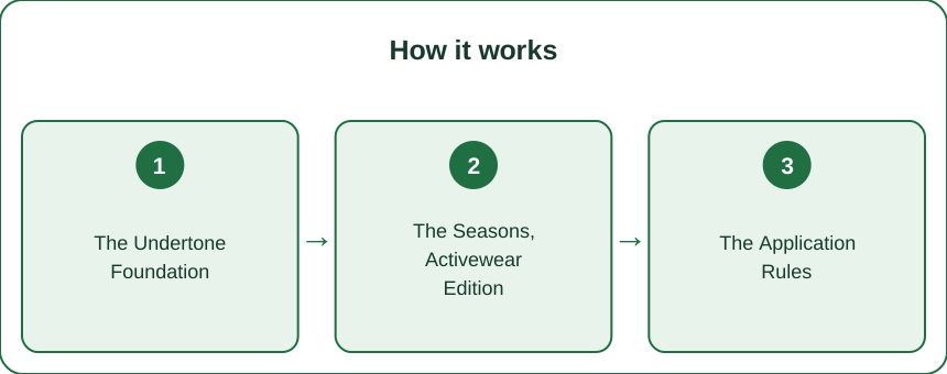
How Do You Find Your Undertone at Home?
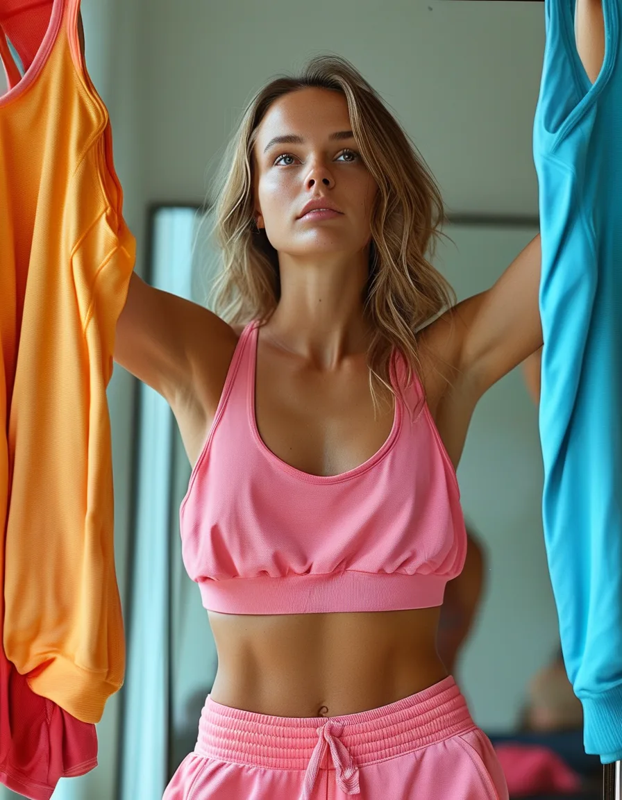
Three tests, five minutes, natural daylight only. Store lighting will lie to you.
1. The vein check. Look at the veins on your inner wrist. Blue or purple leans cool; green leans warm; a mix of both suggests neutral. This is the classic first sort and it’s right more often than it has any business being.
2. The jewelry test. Hold a silver piece and a gold piece near your jaw, one at a time. Silver flattering means cool; gold flattering means warm. Most people already know their answer here and just haven’t formalized it.
3. The white-versus-cream drape. Hold a pure white item under your chin, then a cream one. Pure white flatters cool undertones; cream flatters warm. Watch what happens to your skin, not which fabric you prefer.
If all three agree, you have your answer. If they disagree, you’re likely neutral — which is common and means you have more options, not fewer.
One honesty note: self-testing is directionally useful, professional draping is more precise. But activewear is a low-stakes category. Directional is plenty. This is leggings, not a wedding dress.
What Are the Four Seasonal Activewear Palettes?
Once you have undertone plus intensity, you land in one of four groups.
Winter — cool and bright. Jewel tones: cobalt, true red, emerald, deep purple, and high-contrast black-and-white. These are the saturated colorways most brands make their hero pieces in, so Winters have the easiest time shopping.
Summer — cool and soft. Dusty blues, mauve, soft grey, lavender, rose. Muted pastels that photograph as expensive. Summers should avoid anything neon, which overwhelms rather than lifts.
Spring — warm and bright. Coral, peach, warm turquoise, golden yellow, clear apple green. The energetic tier — brights with a golden tint rather than a blue one.
Autumn — warm and deep. Olive, rust, chocolate, mustard, terracotta, and the whole earth-and-camo family. This is the palette the gorpcore and outdoor world already runs on, so Autumns are well served by technical brands.
Every brand’s seasonal drop covers all four groups. The skill isn’t finding your colors — it’s recognizing which quarter of the drop is yours and ignoring the rest.
How Do You Apply Color Analysis Without Obsessing?
Four rules keep this useful instead of exhausting.
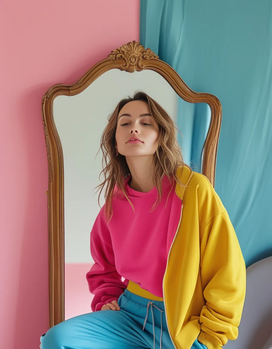
Tops carry the verdict. Color analysis works by reflecting light onto your face, so its power drops off sharply with distance. A sports bra or tank is in the zone. Leggings, six feet of body away from your face, essentially are not. Practical freedom rule: your season for tops, anything you like for bottoms.
Black isn’t universal. This is the finding that surprises people most. The default activewear color genuinely suits cool seasons — Winter especially — while many warm-season people look noticeably better in charcoal, navy, or chocolate. If black tops have always felt slightly harsh on you, that’s not in your head. The all-black gym uniform has alternatives.
Use the accent slot. Build your drawer on universal neutrals and let your season fill the accent rotation — roughly two neutrals, one season color, one wildcard. Neutrals stay flexible; the accent piece does the lifting.
Shop the shortlist. On sale day, the twelve-color wall becomes your three. Decision fatigue solved, which is worth more than the color theory itself.
If you’re buying one piece to test this, make it a top rather than a high waist yoga pant — that’s where you’ll actually see whether the palette does anything for you.
Myth vs Fact
Myth: You need a professional analysis to know your season. Fact: Professional draping is more precise, and it costs $150–500. The home tests get you the right quadrant most of the time, which is more than enough for leggings and sports bras.
Myth: Your season locks you out of colors you love. Fact: The palette is a tool, not a law. An out-of-palette color you genuinely love is always legal — the analysis just explains why certain colors keep winning without you planning it.
Myth: Everyone fits neatly into one of four seasons. Fact: The four-season model is a simplification of a 12-season system, and plenty of people sit on a boundary. If two seasons both look fine on you, you’re probably neutral and you get both.
Myth: Color analysis matters equally for all clothes. Fact: It matters most within about 12 inches of your face and almost not at all below the waist. Anyone telling you your leggings are the wrong season is overselling.
Why Is It Worth Doing at All?
Wear rate. The clearest real-world effect people report isn’t compliments — it’s that in-palette purchases actually get worn. The wrong-color bargain was never a bargain if it lives in the drawer.
Photos. Race photos, class photos, the gym mirror selfie. In-season colors consistently make a face look awake rather than washed out, and photos are unforgiving about this in a way mirrors aren’t.
Compliments as data. Once you start paying attention, you’ll notice which colors reliably generate “you look great today” — and they’ll cluster in one quadrant.
The legging wall was never twelve decisions. It was one undertone question, answered once.
Mini FAQ
Can your color season change over time?
Your undertone doesn’t change, but your contrast level does — greying hair in particular usually shifts people toward softer, cooler palettes. Re-check after any significant hair color change.
Does color analysis matter for leggings and shorts?
Barely. The effect is concentrated near your face, so bottoms are the one category where you can buy purely on what you like. Save the palette discipline for tops, bras, and jackets.
Is black really bad for warm undertones?
Not bad, just rarely optimal — many warm-season people look better in charcoal, navy, or chocolate brown, which give the same versatility with less harshness. Try one dark neutral that isn’t black and compare in daylight.
TL;DR:
- Three home tests — vein, jewelry, white-vs-cream — get you to the right quadrant in five minutes.
- Winter = jewel tones, Summer = dusty pastels, Spring = warm brights, Autumn = earth tones.
- Tops carry the verdict; wear anything you like on the bottom half.
- Black isn’t universal — warm seasons often do better in charcoal, navy, or chocolate.
- Treat it as a shortlist tool, not a law. The colors you love are always allowed.
See It in Motion
Seen here: Super High Waist Embossed Yoga Leggings with Inner Pocket — shop it on bubblelime.com
Keep Reading
This article is for general informational and styling purposes only. Fit, sizing, and product availability may vary.